2021 Chevrolet Traverse
Last Updated:
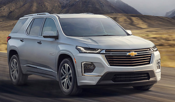
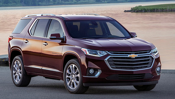
The Chevrolet Traverse is getting a few changes for 2021. (new one on top)
It actually looks a bit more modern now. It seems cleaner. Everything seems to be better integrated.
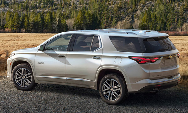
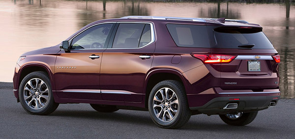
Same thing in the back. A bit more modern and slightly more aggressive even.
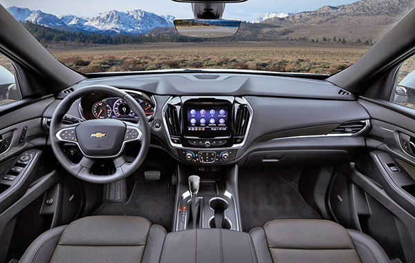
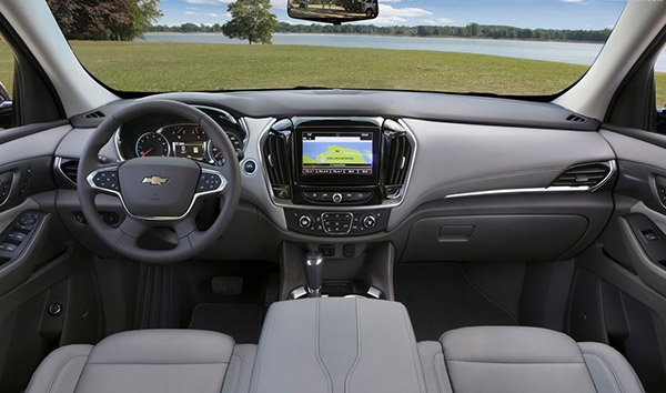
Inside, it’s hard to see anything new. Which is OK I guess.
This doesn’t have a luxury brand atmosphere like the new Telluride. But is still more modern than the Honda Pilot interior…
They could have done something better with the screen and its surroundings. Although I do like it is not a tablet stuck up too high on the dash.
In other news, you can now get a double sunroof as an option. Which is always great…

The "double sunroof option" has been offered since 2009.
I am actually shocked how much those small changes improved the exterior. It is such an improvement. Such a shame about the interior though. That 'bubbly' steering wheel looks very dated. Wish something more along the lines of the new Tahoe interior had been put into this – although then we would have to listen to you complain about the tablet screen (sorry- but you just need to get over that)
I don't think anyone should get over the tablet screen.
Besides being the laziest design choice ever, it is a huge distraction. I have driven many cars with that "stupid feature".
And I can tell you that at night, it is a huge distraction to have this screen in your line of view while you are driving and are supposed to pay attention.
Sure, they do get darker at night. But they also often show tons of info that actually do not get darker. Like white or light colored album covers of the song you are listening too.
Bright color screens right in front of your eyes when you drive are a very bad idea.
Incorporating them in the dash design or in the top portion of the console is the way it should be. If only for safety.
Vince you know almost all of those screens can be turned off if the driver wants, right?
Ok.
This is definitely an improvement.
I think the 2020 exterior looks better myself.
They fixed the big Achilles heel – the front end always appeared weak and unsupported with no visual tension – they created a bold, solid front end now to aligns with those same characteristics throughout the rest of the body. Well done.
Well if it helps sell more I guess that's a good thing. I find it different but no better, no worse. I guess that's better than the Malibu which got blingier and uglier in its mid-gen change.