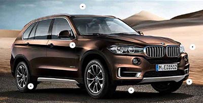
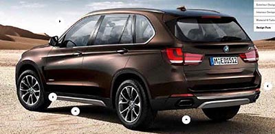
All new BMW X5
Last Updated:
Hard to tell ins’t it. This is really pushing the idea of making the new one looking like the old one.
Only current owners will be able to spot the all new model.
This seems to be one of the worst case of a “new” design around. Why even bother?


Horrible. Rear and and sides remind me too much of original. Front end and front sides remind me too much of the X3 (Horrible). The rear glass is too tall and looks awkward. All and all I highly dislike
Almost bought an x5 but REALLY NEED a REAL 3rd seat (the current 3rd seat is for tiny children ONLY). So I bought something else. Looks like this doesn't solve the problem either. I was really hoping they'ld make something that could compete seriously with the Truch of the Year (Mercedes GL) and Escalade.
F'real?
Looks like nothing more than an obese version of the current X3… a vehicle that isn't much to look at in the first place.
I agree with the other comments. This looks like it went downmarket instead of up. Too much X3 influence, which is not a good thing as the x3 is probably the least good looking car in BMWs stable.
I just finished posting on Nissan News Bureau the all new Murano Concept called Resonance…..It will be shown today in Detroit
As for the 3rd row problem, they really need an X7. It's been in the rumor mill for months, but has yet to emerge. The rear is X1 and the front is current X6. They might as well stuck with the current model and just gradually added tech over the next 7 years.
– FusioptimaSX
to: Dav
Obese is hardly accurate. These things will taka a corner faster and flatter that most sports cars (including Mustang, Camero, anything from Lexus or Acura and most things from Mercedes) We had an x6 (same platform) up to 180 the other day and it was remarkably stable. In truth, it's a bit of a sleeper.
They can only ruin the current X5 look…which is perfect. This looks more juvenile.
You know, the more I look at this, the more I think is isn't it. The details seem wrong. The wheel sizes are off from each other even more than perspective dictates. The grill has no depth despite that being their trend now. It looks like a sketch made from the spy shots where the stance and detailing are inferred. I could easily be wrong, but something just doesn't seem right.
Why bother is exactly right!