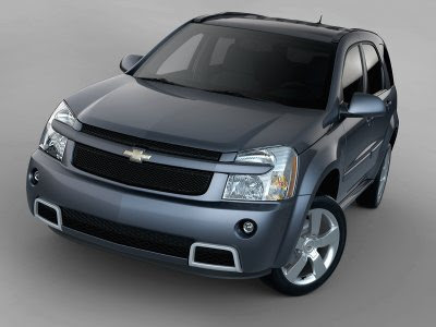
2008 Chevrolet Equinox Sport
Last Updated:


A rather nice looking and low key update on an already decent design.
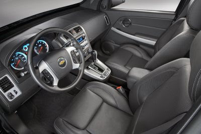
It looks like they also upgraded the console a bit.
The Equinox interior has always been quite plasticky, but nothing like the Escape I drove last week.
At least it is pleasant to the eye. And squeezing GM’s 3.6 Liter V6 in can only make it a much better choice than the poor old Ford.

Not bad, but a little WASPIE for me, no offense.
Chevy need to do something about the emblem on their cars, that bow tie doesn’t do it for me
and kind of has a religious connotation to it.
The Dodge grill also has a similar cross look to it too, but I rather drive a Nitro over the Chevy IMO.
It will be over-priced. GM is run by MBAs after all.
kinda kewl, yepo but that nasty ass front end needs to go, this and the colorado with there broken up headlamps make the aztec look like a beauty pagent queen !
The Equinox needs smaller headlights – the current ones are way too big. The interior is also like a Rubbermaid showroom.
imo, the straight lines of the escape interior are much more pleasing to the eye
this kind of curves in interiors looks gaudy to me
I test drove an Equinox for the hell of it a few months ago. The interior is awful compared to Japanese competition.
I don’t think this model will help… What IS going to help is that new Vue. That vehicle is gorgeous, and the interior (in pictures) looks great. I can’t wait to drive one of those and I am not GMs biggest fan!!!
That is saying something.
MR
I agree on updating the emblem, but for different reasons. Gold on ANY car is just plain tacky. Besides the big gawky bowtie just looks plain corny. Needs to resemble something more like the modern Opel Emblem….silver, chrome or titanium only: https://cartype.com/images/page/Opel_logo_02.jpg