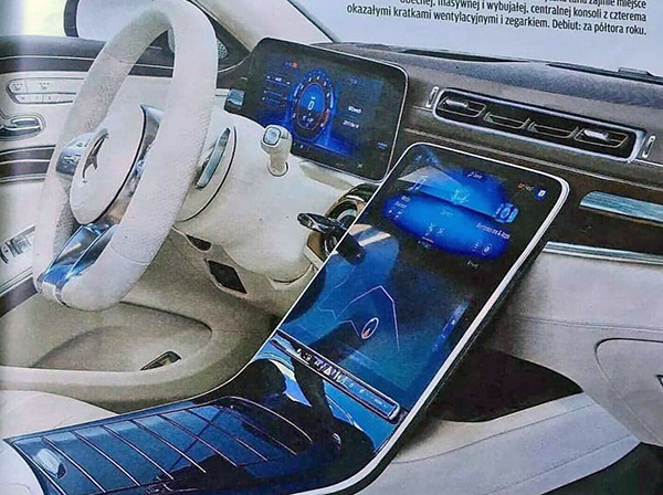
2020 Mercedes S-Class interior
Last Updated:
I know it does match the various spy shots we have already seen of the all-new S-Class for 2020.
But I really hope this is just an illustration…
As an interior like this just seems to be chasing Tesla instead of coming up with something new.
It almost looks ridiculous to me. Like it’s been thrown together by a 14-year-old.
What do you think?


I think it's just an illustration but probably isn't that far off. That center tablet is oddly angled and that isn't the case in the spy shots; the steering wheel does not match the spy shots; and those vents look way to cheap to actually be what MB goes with. Also it looks like there's some sort of key slot/ignition to the left of the tablet screen…which makes no sense given that everything is pushbutton now.
The speedometer/guage cluster above the steering wheel looks like an econo car.
Are there S-Classes without start/stop push buttons? I don't know if this is an illustration or not but for that price they at least should include that.
Definitely not nearly as impressive as MB's current S class interiors. A definite step back in perceived quality.
It may be something like this, as we have already seen prototypes around. But this is just an illustration. Door panels and buttons are exactly the same as in the current model: https://www.netcarshow.com/Mercedes-Benz-S-Class-2018-1600-35.jpg
It may be something like this, as we have already seen prototypes around. But this is just an illustration. Door panels and buttons are exactly the same as in the current model: https://www.netcarshow.com/Mercedes-Benz-S-Class-2018-1600-35.jpg
If this is the interior of the next S-Class, it is bloody ridiculous
Unfortunately, until someone has a break through in interior design, this type of tablet integration will, sadly, probably be the norm for awhile.
All that overt tech and then that big-ol' analogy key sticking out of the dash…
I think that as often as you express disappointment that production interiors have lost of the flash of their show car prototypes, you should like this one. It has a definite show car vibe.
The part I don't like is the four vents in a row above the screen. That looks similar to the treatment in the new GL SUV and I thought it was very clunky there.
That's a photoshopped mess to say the least.
Looks great to me! I watch all my entertainment on 82” UHD TV! I do like the expanded functionality in a bigger infotainment screen.
um there is to much glare already on all the screens when they are at that angle.
would you say that it is … … … Vulgar?
it looks far better than cheap plastics and the over use of knobs like the dated BMW dashboard.
This is definitely a photoshop – if you compare it to the interior spy shots we have so far of the S-Class you can see the screen has the same reflection as those photos. The door panels and steering wheel on the spy shots are totally different than this as well, which appears to meld the current S-Class interior with parts of the spied interior…
Also look at the thickness of the steering wheel. No way is that real.
Appalling.
The steering wheel is quite thick!
Oh my God. Any car that doesn't have the tablet sticking out the top like a damn tombstone gets my vote.