2007 Chrysler Sebring sedan. Even more…
Last Updated:

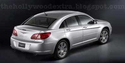
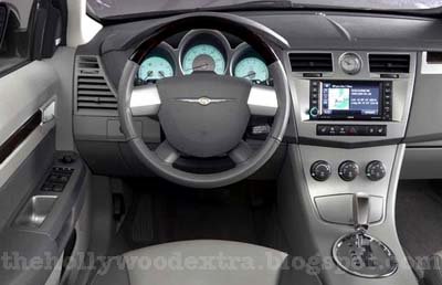
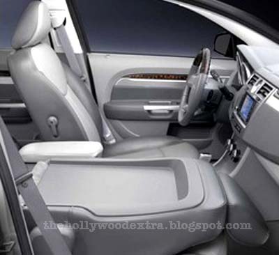

Seems like most people here don’t like the car, and were waiting for better pictures.
Well… Here they are.

Last Updated:


Seems like most people here don’t like the car, and were waiting for better pictures.
Well… Here they are.
looks a lot like the saturn ion. i’m not really surprised by it anyway.
Blah. I’m not going for this at all. It looks like a 90s Korean car. Yeah, not feeling this. I’ll pass.
Actually, I’m curious as to what the convertible will look like. Any pics, Vince?
Dodge Caliber dashboard + Saturn Ion side + Chrysler Pacifica front = 2007 Chrysler Sebring.
And what about engines?
2.4 16v. 170bhp ?
2.7 V6 24v. 200bhp ?
3.5 V6 24v. 250bhp ???
2.0 TDI 140bhp (Europe only)
the interior is not such a disaster. it’s actually decent but nowhere near the level of the *current* accord or new camry. i can’t tell if i like it better than the fusion/milan’s interior…
the panel that holds the climate controls looks very nissan/infiniti…first it was on the Z…and then the 2007 altima…and now the chrysler sebring?
I think this car will be successful. It provides interior configurations SUV tradeout buyers will expect, and a better level of fuel economy. Parked next to a Fusion or G6 it will look like a good value. Not every product will be an enthusiast oriented Mustang or Camaro. A small criticism of this car and the Caliber is that the use of plastic exterior trim pieces is not successful. The black plastic roof trim rails on the caliber look terrible and cheapen an otherwise viable design. The plastic triangle trim piece at the C-pillar on the Sebring reeks of cheap. Why not make this trim out of glass with a black backing – this would look much better.
RW
It reminds me a lot of the Pacifica and it seems like many companies are doing the “almost-hatchback” sedan look with the really short decklid. The Chrysler 300 is another example. I don’t think that it really looks like an ION, but it doesn’t seem to push the envelope of design. I do really like the interior though, although I’ll reserve judgment until I see the materials used.
Contrary to popular opinion here, I’d say that overall it’s nice-looking. Certainly we’ve seen every styling cue before so perhaps we’re all jaded. Sure, concepts like the Airflyte are striking but for mass production most every feature, line and proportion has to be compromised for a myriad of reasons…safety, lighting requirements, sight lines, human and cargo packaging, handling, engine cooling just to mention a few. All in all I think it’s pretty amazing that in light of all their restrictions that designers get as many pleasing vehicles on the road as they do. I bet any one of us who got to spend just one single day inside the design and engineering tanks of any automaker during the development of a new vehicle would come out with head-spinning and overwhelmed at the process. As in any field there are dream-makers and pragmatists and when the real world is your market the product is rarely a filet mignon but more likely a stew.
I bet when one of these new Sebring photos shows up in black with chrome wheels a lot of us will modify our initial impressions.
I agree that the sweeping roofline and short deck resemble the ION, and the 2007 Nissan Sentra as well. I’m never a fan of when the designers have to fake the window opening with a patch of black trim–let’s try to get the designers and engineers on the same page, people.
At least it’s interesting. But then so is the Crossfire, and those site on dealer’s lots practically forever.
As always, the concept was considerably more attractive.
c pillar way too thick, saturn saturn saturn
The only upside for the exterior design of this car is that it makes the interior look half way decent.
Whereas the Calibers outstanding exterior makes its interior look like a POS.
I just hope the Avenger is decent looking.
I think some people (a lot in fact) are missing the point. The Chrysler Sebring is a mainstream midsize sedan which needs to attract buyers looking more for value and features rather than killer looks. As others have mentioned, not every car a company sells need be boy racer cool. Hell, that’s why Toyota and Honda build their boring midsize sedans. The Sebring is a pretty nice looking car, though it does suffer some design pratfalls. But no car is perfect and we can pick any one apart endlessly. Plus the interior looks pretty nice, though I’d like to see one in black with black leather. If the Sebring is priced right, offers good value and is reliable, it’ll do well.
I can see some BMW z4 and MERCEDES design elements on this dashboard. Pretty good compared to the exterior.
I FUCKING LOVE IT!
When I scroll past the Sebring, I keep seeing what I think is an Avalon in the rear. Larger lights, certainly, but something similar.
I FUCKING HATE IT!
I seen the Sebring on cnbc earlier today; it did look better than the pictures we see here. The interior was very nice, the depth of the bumpers looked good. I wish that they had kept the Airflyte front end completely. I was hoping for a better rendition of the concept.
It’s a crap….another loser
Sort of looks like a Chinese designed car, to me, anyway. 😉
It’s not Aztek bad.
It does not “stir me” to want one, to be the first guy on the lot, the day my local dealership gets the very first model, and test drive one.
No.
It does look more interesting to me than a Malibu(the Maxx is better looking and a better idea).
It’s still a sedan, though.
Gimme a decently designed(not suv-like) car, or 3 door car(even a small-ish tC).
FUCKING AMAZING! FUCKFUCKFUCKFUCKFACE AMAZING!