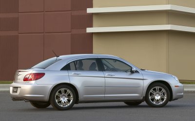
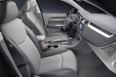
Even more Sebring pictures.
Last Updated:


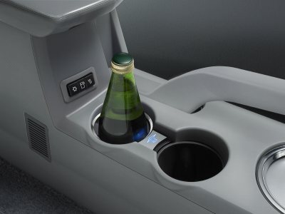
Some of the features are pretty cool. Like the refrigerated cup holder.
Or the sound system with a hard drive where you can transfer your music from an iPod.
Otherwise the look isn’t for everyone.
And after seeing the interior in person I can tell you that the quality is pretty much what you see on the pictures.
Not that good….

I can’t understand why everyone is complaining so much and being so extreme in their reactions. They must have had really high expectations for this thing. Personally, I think it’s pretty nice looking and certainly much more interesting than the current Accord and Camry, the cars that it’s designed to compete with. I applaud Chrysler for being one of the few automakers out there that is willing to take chances with styling. Given time, I believe this design will grow on people.
It’s so different from the current model. Looks too 80’s on these pictures. The current one seems more classic and elegant while the new one is “trying too hard”: too many bits and lines and yes, very subaru-like.
Right now, I say don’t like it.
Maybe it needs some time.
Whoever did the photoshop that “Anonymous” linked to (two postings above this one) did a great job. They addressed several of the weaknesses I saw in the design myself. The biggest one is the awkwardness of those black triangles just behind the rear passenger windows. That improved version should be forwarded to Chrysler so they can incorporate those changes before it hits production.
Well, I’ll be.
Wasn’t Chrysler designing the “NEW” American cars? I thought hy were trying to get away form trying to make japanese looking cars! Did they not look at the bank account to see what the 300 redesing from a japanese wannabe to a original American desing achieved?
Whether the car is a disspointment or not, I think it is personal taste. I did expect something with more character and less japansese looking.
$10 says this was designed by the same idiot who designed the Chrysler Concorde.
This has to be the biggest design disaster since early 90’s Buick Skylark.
Who signed of on this mess? The gigantic lights make this car look like a compact car. The ridges on the hood look like 10-strand combover of a balding man. Creases and panel gaps all meet at the wrong places. I just cannot getover how bad this car look. I don’t remember getting this offended at a design. They expect people to buy this?!
ummm…. according to yahoo finance news, “as good or better than any other mid-size car in the world, period,” Chrysler Group President Tom LaSorda said. whaaaat???
are you kidding me? and look at that ugly butt and c-pillar!!
The old Neon looked better(I know, compact design, but it looked better).
Wonder how much they’re going to charge for this “thing”.
Hope it ain’t above 15K msrp.
They should hand out sunglasses, with a 300 painted on the lenses, before letting anyone look at them on the lots.
I bet the Dodge Avenger version of this car looks a lot better… the proportions will suit a Charger-style car better. Maybe not great, but it won’t look as wrong as this Chysler.
I agree with the comment above that this Sebring is “trying too hard.” The overall effect of the styling hits a bad note and a lot of styling details just seem forced.
I was hoping for a hit for my friends that work at DCX, and feel sorry that this one looks like it won’t work too well. But who knows, time will tell.
—
Sohl
Three Words :
HIDEOUS BEYOND BELIEF!
that beverage holder is heated too
This site said 172HP 4(GEMA), then a 190HP V6(and people complained about the 2006.5 Optima’s 185HP V6), and a 200+(forgot to look) HP V6(3.5 liter?).No prices yet.Sorry, if I were to buy, I’d stick with the Optima.take care/not offense