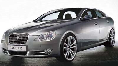
2008 Jaguar S Type
Last Updated:

This illustration from Autoweek is supposed to show us what the next S Type would look like.
I hope they’re wrong.
This makes me like the current S Type even better. I had the chance to drive a few of them over the years, and it is still a f great car.
The retro design still looks great.
This looks like a bunch of designers worked on it and never talked to each other.
I hope the real thing looks much better. They need it…

Are you kidding me Vance? this car looks great, its unique in its own way and plus the chinese will probably copy this. of course this car wont beat the likes of the future a4 or a5, but still i would consider buying one.
Vince, your 100% right! The new design or whatever you call it is shamefully disgusting and serves no meaning to the marque at all which is suppose to be about tradition. The XkE is nice and I would like to own one, but that is as far as Jaguar should go with modern. The new S looks like some Korean rip off
of an Italian design. Kind of what Kia is trying to do with their sedans.
i agree for a jaguar this should look much better, the above post is a little extreme and crazy sounding “just a car” because it is a nice looking car, but not as the replacement for the s type jaguar needs much better desighn especially given their current financials, how an ex “aston martin” desighner came up with this for a jaguar sedan i have no idea, i expected a midsized cls competitor shape something bold, elegant, classic but modern, this would be nice as a top of the line hyundai maybe or kia, but not as a jaguar to run with e class, and 5 series.
i like everything from the a-pillar back. very substantial, muscular yet not bulky!
before reading the title, i saw the image and thought, “a new asian car” whoops. the prev. gen. sonata tried to copy jag/mb in terms of looks. and looking at this illustration’s headlights, it looks like the original copied the copy!
the front end doesn’t look fierce or classy enough – especially for a jag. it has this vacant, placid happy look on it’s face. 🙁
Hopefully its just a dodgy illustraion. Who knows what Jaguar may be in a position to do in the next year anyway.
Those headlights looked far better on the 300M and should have stayed there …
“The retro design still looks great.”
That’s akin to saying that the dung beetle doesn’t smell too bad.
You are applauding a car that is universally agreed to be retro design at its worst. Granted, it drove well, had a lovely diesel engine, but the first interior was plain embarrassing and the facelifted car still had niggling interior issues.
Yes, the illustration looks terrible, and yes, let’s hope the real thing looks better, but it is undeniable that the current one is sinfully ugly, to be polite.
Tho I like this new look, isn’t it just a refresh to followwed by an all new XJ-derived model coming a couple years later? Thought I read that a while back – has it changed??
horrible illustration/chop its not going to actually look like this
Scary!
To survive, Jaguar needs a new design theme. A contemporary interpretation of the classic British car has been sorely needed for years. Forget about the anachronistic British style. It’s over. This style used to look stately. But now this look has been so overused, and bastardized (or simply-put “stolen” by Kia/Hundai) that it just looks like a cheap Korean-esque knockoff.
Volkswagen
looks like a sleek KIA Amanti since when does a car company of this stature copy a korean design. i think it looks odd
Talk about wrong proportions in that illustration … and those Toyota Mark X headlights don’t help either
This looked like a chop but autoweek seems to be billing it as the real thing.
Oh crap, well thats it for Jaguar. It couldn’t afford such a crappy design as this one. This thing has nothing going for it.
Its not just too sytlish or polarizing as im sure some jaguar people might claim at first, its just a poor, upgly design. Damn.
Getting uglier…why not just go for a mini XJ look?
Ford mad a good decision of pulling out.