2008 Chevrolet Malibu
Last Updated:
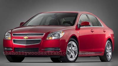
Still good looking on these new picture.
As expected, engines will include the 2.4 Liter and the new 3.6 Liter V6.
Both with 6 speed auto.
At least on paper, the specs match the Camry (and others).
Wheelbase is even 3 inches longer than the Camry.
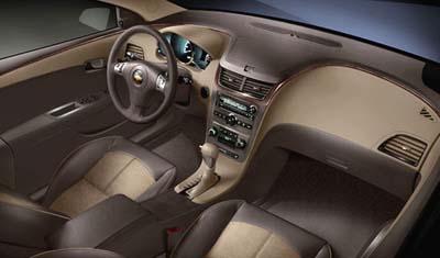
The interior seems nicer and more original than the more expensive Aura. (Bad news for Saturn)
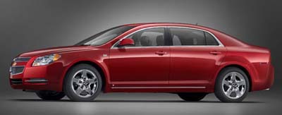
The roof line looks like a much more expensive car, but…
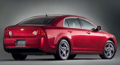
What happened to the back?!?!
These tail lights look pretty bad.
From the spy shot I, somehow, thought they were going to be 4 round lights back there.
It would have been much better. This weird shape is kind of a letdown. And this is on a red car. This will stand out even more in another color.
But hey, this is still miles ahead of the current model, and at least as good as most of the competition.
I think the ones suffering the most will be the Aura, Fusion and Sonata.
Not sure if Camry/Accord owners are ready to buy anything with the name Chevrolet on it…


“At least on paper, the specs match the Camry (and others).”
The side profile seems to match the Camry’s too…not bad for a Chevy though, and way better than the current Malibu
Kissy Kissy!
Very pretty!!
Anything would be an improvement over the old Malibu, the old model was the ugliest car on the road !!
I totally agree with you Vince, except for the interior… It looks very cheap and boring to me. Give it some round vents and it would improve it a lot. It would look like everything else on the market though.
It would be great if they didn’t put the 3.5L or any engine of that family in that car. It would ruin it.
A bit too long for my taste but the market will probably appreciate it.
I like the back side windows. They came directly from the Phaeton. The back lights aren’t that pretty but their shape comes from the M45 which is good. Some tuner will probably give an alternative for that…
You can also notice that some of the back lights are in the trunk lid. So this design could probably be changed easily some day.
Overall it looks like a japaneese car, which is great.
Now chevrolet has to work on its logo… It cheapens the look of the car A LOT at the back.
Japanese cars owners will now have to rethink their perception about GM… Especially with those 2 great engines (from reputation)
Phaeton back side windows, M45 back lights, Impressive front grill, great engines (as long as they don’t bring back the 3.5 with 4-speed auto) : This car is a winner.
As long as you don’t sit inside… But I seem to be the only one here that doesn’t like the dash.
Japanese car owners will have to seriously rethink their perception about GM. Especially with that cadillac engine and 6 speed auto transmission. It has nothing to be ashamed of.
Thank you Bob!! (Lutz)
The whole car is ruined by the fugly rear end…
I really like this! & won’t be surprised if an SS version (or sumthin) gets the round taillites.
I was expecting round tail lights as well, i think they would have looked much better and added some american style. I hope the ecotec has been made smoother.
I love this new look(except those tailights-I hope they look better in person) This kinda look like the Camry in a Chevy two piece bikini! 🙂
Looks better than the Sebring, but is it better than the Avenger?( the front end might be, but that is all I can tell, in photos right now…Avenger is slightly ahead, rest of the car).
6 speed automatic is cool. I expect(shortly,maybe next year, 3rd year of their respective 5 year runs) Ford Fusion and Kia Optima will try to match GM with a 6 speed automatic( well, the cool thing about Kia is you can shift it yourself, or let the computer do it for ya! And it is a 5 speed,and IMHO, the whole package looks more “normal” than this).
Similar things could be said for Fusion( minus the auto-manual shifter on Optima> That is one nice little feature, believe me).
This is a good looker, at the price there is not a better looking sedan on the road. GM you have a winner, and you should hear lots of ringing registers, with this one.
boring, boring, boring.
Every inch of that vehicle has been done before -and better by other manufacturers. Just look at the front valance/foglamp treatment. How many other cars use that exact same design…about 15 at my last count. Nothing at all wrong with this design but nothing says “new”, “exciting”, “original” or even “Chevy”. Without the ugly badges it could be anything from anywhere in the world. Chevy’s in the ’60’s were distinctive and exciting. This one’s just another big yawn…safe, efficient, and reliable. Just like your refrigerator. I guess when you’re on the edge of financial collapse it’s just not good business to offend or excite anyone too much.
G6 GT is sooooooo right about the logo. I have been saying that for years! Gold is such a no no on a car. Both Chevy and Ford need a logo redux.
By FAR the nicest looking sedan in it’s class. And it should be very affordable. Who’s got a better sedan than this for the price? Nobody.
GM where have you been the last 20 years?
I was going to write something, but then again, it’s a GM product so why bother…
It’s the 2008 Chevrolet Camry!
This is a great looking car especially for the price range it will be in, Good Job GM, this one is a major improvement, and if the rest of the products are going to continue to get better, you’ll keep your #1 spot.
shameless rip off of japanese and german styling.
I can’t wait to see the 2008 accord.
one of the big car mags C&D i think, just did a family sedan compario, and the current, aged accord beat everything. wow
Okay, maybe I’m just seeing things… but I think I saw one this afternoon. Does anyone know if Chevy is testing any of these things in NYC? It looked fully finished and completely undisguised. It went by slowly enough that I clearly saw the front end and the rear, but was too far away for me to see “Malibu” anywhere on it. The bowtie was very visible though. Would Chevy be testing the new Malibu or attempting to create buzz this way? It seems a bit too soon to have fully running examples of this car.