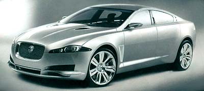
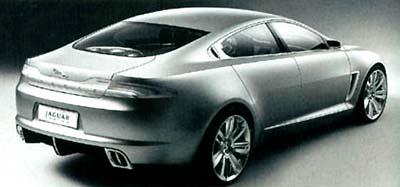
Jaguar XF Concept
Last Updated:


This is pretty much the way the production model will look like.
Especially the sports “R” version.
I like the shape but these headlights look a bit weird on a classy car.
And the whole thing doesn’t obviously say Jaguar to me.
But these are pretty bad pictures. At least, we’ll get to see it and some of us will be able to own one.
Unlike most “concepts” we’ll see next week.

grotesque proportions. really awful face. they did a good job of hiding the actual design when they put out that teaser pic a week or two ago. this is pretty bad news for Jaguar’s future.
Side profile in the top pic looks waaaaay too much like the Lincoln MKS. Ford didn’t learn from the X-Type? Jaguar = screwed.
I hope to god that’s just the horrible quality of the pictures, because from what I can see this car is fugly….
I hope to god that’s just the horrible quality of the pictures, because from what I can see this car is fugly….
Car and Driver said the new “S-Type” will NOT look like this b/c they want the car to appeal to a more mainstream buyer. The proportions of this concept are smilar to a MB CLS, which is NOT a mainstreamer. I’m sure a lot of the styling elements (the wede profile, the grille, healamp treatment) will reach production. But if you really like this concept, don’t get your hopes up for the real thing…
Cool Jaguar Mondeo, after an elephant sat on it?
If Lexus and Aston had a baby this is it!
That looks like something from Korea.
That looks like something from Korea.
No, forget Korea. It has the face of a Seat.
I kinda like it. Everything except the front, which looks a bit like a nozzle to a Hoover. But the rear and side profile are pretty sweet!
I can imagine the driving position. It’ll feel like sitting in a bathtub. The outside looks ok though, I’m sure someone will buy one. Why I dunno.
Jaguar do need to create a style that takes it past the XJ6 look. The X type was a good example of why certain styling cues don’t translate so well into different sizes of car. The S type hinted at where Jag style could go but seemed underdone. This thing looks impractical but from the rear those surfaces meld beautifully. They may be moving in the right direction (as long as the do something about that front!).
the headlights are awful! i think of dali’s melted clocks. so they look melted and like they’re sliding down the front of the car. those front spoilers are wretched. the rear tailights aren’t great, either.
what i DO like are the general proportions and the profile.
I like it. Seems a wee bit busy, and the wheels aren’t helping i guess. But I agree about the thing not looking like a Jaguar. The current gen Jaguars look too much like old Jags, but I guess they went in the completely opposite direction with this new one. Fine buy me though. I’d never buy the current XJ, S, and X. But I would consider this new one. (If I had the money that is)