Town and Country interior
Last Updated:


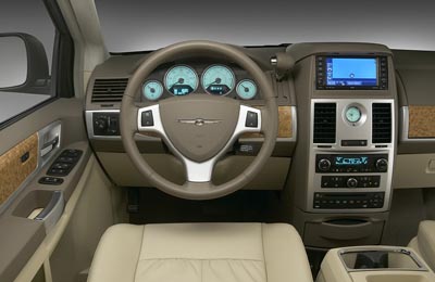
Again, I’m not really sure what to think from these pictures.
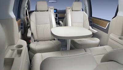
At first, It does look kind of luxurious, and roomy.
But the dash doesn’t seem that pleasant looking.
The shifter placement is the weirdest I’ve ever seen, and the fake wood looks pretty bad. And there is a lot of it everywhere…
Is it a preview of what’s in store for the new 300 interior?

Yeah, I’d take a column shifter over something that looks like it was attached to the dash as an afterthought… The fake wood isn’t great, but it’s better than what you find in other vehicles of this class… At least they’re going with a matte finish as opposed to the glossy, orange tinted fake wood in my Grand Marquis.
Minivans aren’t my cup of tea, but I wouldn’t trade it right away if someone gave me one of these, which is more than I could say for the current generation.
What is up with that table? Does that Stow’N’Go too? The interior looks extremely cheap, but functional.
Ohhhhh! I get it, Chrysler’s doing retro! Part VW hippie bus, part 1975 Cordoba.
This thing is hideous. And I predict it will be a disaster for Chrysler.
Mornin’ All,
Foremost – Vince, I’m a long time lurker (better end of a year now), but have never before posted, and I wanted to now take the opportunity to send ya a sincere thanks for all that you do (and post) here. Your blog has been my first stop/check in the morning (and evening!) for some time now, and I’m sure I speak for many when I say how much those “car-nuts” among us appreciate what you do (and post) everyday.
As to “this” posting – I gotta say my feelings are mixed. I had HIGH hopes for the DCX vans, and from what I see, I’m not sure if those hopes were realized. While even from these few pics, it does indeed seem there will be nifty features inside (swiveling seats for example?), but in the “nuts and bolts” department; materials quality, panel fitment, etc. – these vans (again at casual glance, don’t seem to lead the segment.
Moreover, while exterior design is wholly subjective, and certainly these are “vans” and not sports-cars, I’m not all-together impressed. American vehicles by virtue of their own un-doing over the decades, need to regain buyers (in part) through designs that are more than just “adequete,” rather so hot they “force” shoppers to reconsider their brands.
Again, these are but a few pics, and I certainly haven’t seen anything live yet, but at first glance, these new vans (from me), rate a solid “meh…”
i am very doubtful we will be getting the swivel chairs and table layout. imagine the lawyers have already queuing up. It is definitely for the overseas market.
the interior looks nice but i can’t tell the fit and finish from these pictures. so far, it can go head-to-head with the sienna limited.
This should drive sales of the Saturn Outlook.
I think the we may have to accept the certain vehicle types have reached their zenith as far as design and functionality and any further iterations can only spoil the formula. Take the Mustang. After all its years in production with all its various designs, turns out the original really was close to the ultimate, hence its current design. Same with the minivan…first one was a squarebox from Chrysler and it turns out it was the best idea after all. This one will suit its market just fine. It’s not beautiful, it’s not ugly. The interior is huge, functional, pleasing, full of ergonomically-finessed features, comfort and convenience-oriented fittings and fits in a regular parking space unlike many vehicles today.
Trust me, that shifter design was tested in clinics by hundreds of regular folks and engineers alike. Chrysler knows what vehicles to take to the limit and which ones to stay safe and sane with. This one is no Firepower but it will sell like wildfire.
I agree, I think it will sell very well in the US.
Without competition from Ford or GM anymore.
CMON people!
I’m usually the first person to be dissapointed wtih dcx – -especially with the new sebring – -i had such hugh hopes.
And the exterior of this van is, at best, bland – i’ll say. but the interior! although the shifter is a little weird, and theres a lot of wasted space where the vents/clock is/are – the interior overall is great.
Regarding the wood – -i was just commenting that its by far the best looking fake wood ive seen in an american car in a long time and totally acceptable in this space.
Regardng the look and functinality of the seats, as long as they are safe , then these are segment leaders hands down!
DCX cntinues to dissapont its true – -but lets give credit where credit is due!
Wow, Mommy’s ship became Managers’ Lincoln? If those pictures are production model, will that eat sales of Pacifica & Aspen? 40,000 USD range now?!
Chrysler has gone Japanese with that shifter … Honda has had that oddly placed shifter since the JDM 99+ Odyssey… Though it may be functional, the van is down-right fugly! Dollar & Enterprise will love them, however.
c’mon – the shifter is just a slotmachine handle – do the gauges spin and come up cherries? Chrysler’s gambling that their new AllWeatherPkg (daaaaark sunglasses & heavy gloves) will prevent future negative reactions to their f*gly exteriors and nearly as f*gly (& hard!) interiors.
Looks like DCX bought GM’s current CTS center stack since the CTS won’t be needing it anymore.
I thought of the CTS interior when I saw that too… Cadillac got slammed for the “tower” concept in its interiors. Granted, this is a minivan, not a premium sports sedan, but what about that layout says “sweated-over design?” It may be ergonomic, but it doesn’t look harmonious either…
The shifter is weird but even though it sprouts from the dash, its position isn’t too far from where old, column shifters were.
Those column shifters made sense in cars with bench seats in which 3 people sometimes sat in the front. The center stack and console don’t seem to allow 3 in front, so the high-mounted shifter seems to be more of a gimmick than a useful design.
The design isn’t bad–just another boring, but useful box on wheels.