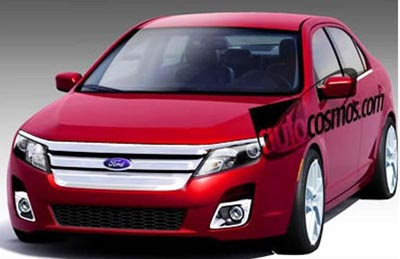
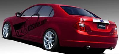
Revised Fusion coming up???
Last Updated:


These picture come from a south American site.
And I don’t really think they are real.
But.. Let’s say they are.
I think the current Fusion looks fine. The one thing it does not need is a new front end design. It looks great as it is.
The rear part of the car on these pictures looks a bit weird.
It just doesn’t fit with the straight lines on the rest of the car.
What the Fusion could use, is a really nice interior.
The current one is fine, but not great.
Ford needs to spend more money in to the Taurus interior before they invest on a new front end for the already good looking Fusion….

The rear end IS very weird lookin’. I like the front, particularly the headlights,I think the front could use a bit less chrome though. I never really liked the front of the current Fusion. Sorry Vince. I believe a nicer interior is in order though.
JM
You should definately tell Ford what you said about the Taurus interior vs. the front of the Fusion. Good luck with that though. I do respect you for your wiseness Vince. I’m not kidding.
I love the front end, but you’re right about the rear. It isn’t coherent with the other lines on the Fusion.
Every US car could use a better interior.
stop bashing the new taurus
it is the best large car you can buy in america period.
a good looking classy and safe car for good american families
at a price normal peiople can afford
i se plenty of the 500 in modesto
the fusion needs nothing it is great
Hey Ford – the Buick LaCrosse just called: it wants its taillights back…
Methinks the Photoshop artist for this one got some inspiration from the E-Class tail lamps.
Even with the quirky rear, this is an improvement in every way over the frumpy current Fusion.
Authentic or not I see the front end as a logical iteration on the new tri-bar theme and I see a bit of influence from the Interceptor show car in the domed hood. (BTW am I the only one who sees the new tri-bar grille as just a modern interpretation of that great ’66 Galaxie design?) I find it interesting to see how all the automakers are dealing with the pedestrian crash safety standards and the higher front-ends dictated by same. This design has the high hoodline but with all that chrome and the new “dip” line, your eye is drawn down, hence the tallness is diminished.
I find the new Ford interiors to be smart although I find some of the hardware design to be a throwback to the squarish 70’s, for instance the interior door pulls. Not a bad thing but the effect is not a soft, cushy environ but rather a harsh, not too-friendly one.
Rear design is a tossup…current lamps are too big and these are too small imho. This is an area that Ford should also use a little retro and go with some big round pie-pans from the 60’s. The old Galaxie’s had some great rear designs. Ford…bring it BACK!
I rented a fusion and thought it drove great. The front end of this picture is really cool.
Love the update, although the rear looks like it might have a load in its pants. But it’s just an artist’s rendering so there’s no reason to get all worked up. With the exception of the base radio unit, the interior in the Taurus is really very nice. The current Fusion interior is very competitive with the competition. Very much on-pary, but not unquestionably better.
I like the new front end better in this concept picture…It resembles a little bit of the European Mondeo’s front end. I think Ford should step away from boxy designs, as most new car trends are going towards swooping lines and graceful curves. I love the current Fusion though, particularly the back…I think nothing should be changed there. And yes, I totally agree with an improved interior…particularly the center dash that houses the radio…please change the big dated buttons for something that fits the car better.
The current Fusion has a terribly boring rear end (among other boring faults). The taillights are plagued with an ungainly wide band of chrome trying to dress up unexceptional lamp bezels containing little character otherwise.
The Fusion (like several domestic models) is a perfectly decent car in need of a more attractive body to compete. These pictures show a concerted effort to correct Ford’s flaws.
Too little too late? Probably. But hope remains.