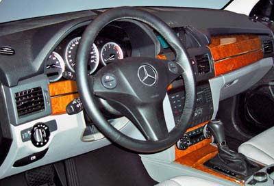
Mercedes GLK interior
Last Updated:

Not as horrible as on the previous spy picture I posted a few weeks ago.
But still….
It will be 2008 by the time this thing comes out.

Last Updated:

Not as horrible as on the previous spy picture I posted a few weeks ago.
But still….
It will be 2008 by the time this thing comes out.
Hey,
Don’t you say thanks for the pic?
Or the pic was sent to you by an old fan??/
I thought u said this was the E-class interior on that post…
I agree it looks like 1998 not 08 and what going on with the passenger side of the dash ??? but id still prefer this over most domestic dashboards, you see most manufactures dont realize that a great dash deisgn will sell a car and a lousy one will kill sales !
when i drive my car im usually inside of it and am forced to look at the dash alot (duh) and if i hate the dash design i wont buy it !
Looks like Mercedes is getting their ugly wood trim from Toyota.
Good lord, how many disjointed pieces can go into a dashboard? If it didn’t have a Mercedes logo on the steering wheel, I’d have thought it was another ugly Chinese SUV. What the… is Mercedes thinking with such a bad thirty year old design?
Once again proving LESS is truely MORE. That is just horrible.
Looks like Mercedes went shopping at JCWhitney, but with Nieman Marcus needless markups.
Should be a hit in Hollywood.
Decidedly Dacia!
Is everyone forgetting that this is the PROTOTYPE. This vehicle is not ready for production! Things could change, and even if they don’t things will improve.
I, myself, think this looks fantastic. Anything is better than the X3s horrible interior.
Vince don’t you think this crap looks like it was designed by some one from Chrysler?
It wasn’t designed by someone at chrysler. It was designed by a Mercedes Designer in Germany…