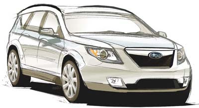
Next Subaru Forester?
Last Updated:
This looks OK, but there is nothing to make it look like a Subaru.
It also seems a bit fake. The badge and grille look like they’ve been added on to another drawing.
Who knows.
This just looks like another “me too” car. Exactly what Subaru shouldn’t be.
Thanks to a reader for this one.


If American keep complaining about their style they
will have to go generic.
Looks kind of OK (it is a drawing after all), but I’m freakin’ sick of the upturned D-pillar. Enough already!
This could be a good design for the Sube. Aren’t most of their designs reinterpretations of more popular cars? This looks agreeable, which is better than weak or weird. The Forester speaks to utility and simplicity.
i heard from a subaru dealer that the forester will be as big as the tribeca and the tribeca will be dropped from the line up.
Looks vaguely like the kuga dropped a few inches with a subie badge on it.
Sub has been moving for the last 6 years to all me too cars. Why would you expect the forester not to look like everything else?
this is what the Tribeca should have looked like in the BEGINNING.
Why are Kia and Subaru as of late playing the “Chrysler Meets Mazda” game in the design department?
> Michael said…
>
> Why are Kia and Subaru as of late >playing the “Chrysler Meets Mazda” >game in the design department?
Ouch but so very true.
I think it looks like a Ford, except for the front view. Copy of euro Focus, c-max, s-max. I’m done with Subaru anyway. After owning three, they aren’t much for longevity.
NOPE!!! This is a concept drawing of the next generation Legacy Outback!