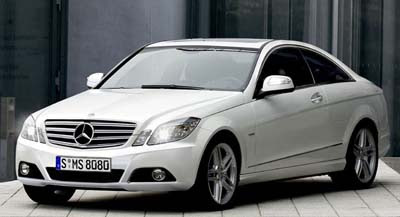
Next Mercedes CLK
Last Updated:

Looks pretty realistic for an illustration.
The current CLK looks nice, but not that upscale for what they’re asking for.
This one should look a it more expensive.
But I have seen spy pics of the interior, and that is shaping up to be pretty ugly.
About as square as the new GLK and the next E class.
It’s too bad Mercedes has decided to rely exclusively on the use of rulers for their upcoming interior car designs…

The end of Mercedes.
I am extremely put off by the new “angled-off” motifs they appear to be edging toward.
They previewed it in the GL, where it possibly worked better due to the car’s bigger-than-a-breadbox package. They need to refresh the G-Class where it will really work.
They alluded to it in the new C-class, which comes off as mid-90s as the Volvo S80.
They botched it in the vomit-inducing GLK…and apparently in the upcoming E-Class interior…
…which of course Hyundai and Kia will still be trying to copy in 2012.
sigh.
Bye-bye, three-pointed star.
What we’re seeing may be the rise of Audi.
Then there’s Infiniti…
WOW!! a Honda Accord coupe with a mercedes grill!!
Seriously, if this is to suppose to do battle with the BMWs and G37 they really need to go back to the lab and rethink the ultra boring and bland grill and Accord coupe side profile
“What we’re seeing may be the rise of Audi.”
Audi is just another kind of “butt-ugly.”
I have teh current car in 550 Cabrio form. And I am not in love with the interior. Cars cool but the interior has too much going on. This one looks like a baby CL so far which is very good. I want to see interior shots though. Anyone know where I can find them?
T
Sorry, all of you are nuts. This is not a Honda or anything below the spectrum of what MB truly is.
I think it looks better. The old C Class et al looked cheap especially with the plastic hubcaps….the side profile looks no different to any current Mercedes…the new C Class is great and the squarer design to me harks back to the more solid designs of the 90s…which is definitely a good thing. Curves can look good but it has to be done right otherwise it just looks cheap and awful…and Mercedes got it very wrong when they tried..
One more thing. Don’t the wheels on this thing look small. Thats one of the problems with my car. It comes with 17’s but they look rather small to me. I would need at least 19’s to make it look right.
T
Why do I have the impression with MB that every time a “new model” comes out I feel like I have seen the design before? They keep evolving the same design over and over..and over. Is this boring or what? Even the “brand new C series” looks as bland as you can get.
I traded cars with a colleague for a beach weekend this past summer and drove his CLK55 cabrio. While it was a blast to drive, the styling is very Honda. Not good for a car that costs around $70k. This picture looks derivative of the current one, but hopefully it will have more curb presence in the “flesh”. I agree that Audi is going to continue to cause MB to worry.
It’s about time Mercedes learn how to use a ruler. suffering with the “Origional Tarus/ infested ameba” styling has always been a sacrifice you were forced to put up with if you bought a Mercedes. Thats the ONLY reason I’ve always stayed with Lincoln/Cadillac/Chrysler and pumped another $50-$250k into each of my cars for upgrades in seats, electronics, and performance. I love the classy straight lines on a glass and chrome skyscraper. I don’t think much of the organic lines on a curvy turd. My wife has a job that REQUIRES her to own a Mercedes-Brand vehicle — but we keep it mostly in the garage at the cottage. Life is too short to waste time in an ugly car. (We only bring it out when she has to meet clients or coworkers). FINALLY someone at Mercedes is looking at styling from outside the factory bathroom.