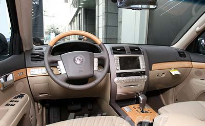
Kia Borrego Interior
Last Updated:

I must say, to me, this looks much, much better than that new GLK interior.
Sure, we are comparing a Mercedes with a Kia. (Which is blasphemous in some circles)
And there are other things to consider.
But still…

Last Updated:

I must say, to me, this looks much, much better than that new GLK interior.
Sure, we are comparing a Mercedes with a Kia. (Which is blasphemous in some circles)
And there are other things to consider.
But still…
I sure see a lot of Volkwagon in here. It does look nice but this looks to me like the Korean verison and Hyundai will not let Kia America grow at a faster rate than it does and will strip their American vehicles to fit their image for KMA.
I think this looks better too than the Merc GLK. The Merc’s interior reminds me of the older Lincoln’s. White interior with piping and larger square design throughout. I hope they stick with black and tan for production. But then again I wouldnt buy this if I could afford it.
Warren
Certainly not ground-breaking but a nice place to sit and ride for a while. I see Kia buys its plastic faux wood from Toyota.
When I look at car interiors all I think is, when is a car company going to take them into the digital age? Someone should hook up with Apple to design a car interior.
That does look pretty darn good.
MR.
Looks like Kia got its piss-colored plood from Toyota.
How is Mercedes going to compete with kia/hyundai? Why is a Mercedes “worth” twice the money?
Yes, there are other things to consider:
Quality – Kia wins
Reliability – Kia wins
Exterior Styling – Kia wins
Appeal to people who know nothing about cars, but pretend they do – Mercedes
boring….
a clean, simply and upscale design if a bit bland. but it looks like a nice, comofortable, open and airy place to spend some time. i’d have to agree with some of the other comments that it looks like a VW interior – a simplified and brightened one, though.
I agree with you Vince. This Kia looks much better than the GLK in the photo.
I think all automakers and most if not all car reviewers think ‘sportiness’ has to be all black interior with a dab of silver trims. I still like the old wood or plwood-look with a tan interior. It is more classy and projects a warm and inviting look.
This looks good. At least they did not mess it up with dumb-dumb “stylists”. Nothing worse than having some goof-ball called a “stylist” putting guffy lines in it.
It also looks a lot like the interior of the new Saturn Outlook.
This looks waaaaaaaaaayyyyyyyy better than the new Mercedes. Nice.
i think they ran out of money and simply took the interior from the Touareg and put it into their car!
Someone got their hands on GM and Toyota parts bin and created a masterpiece.