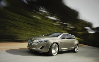
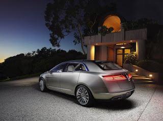
Lincoln MKT Concept
Last Updated:


When Lincoln announced they will get their version of the Flex, it doesn’t mean just slapping a Lincoln grille on the Ford anymore.
This looks great, inside and out. I will post my pictures and videos of it soon.
This is really what a Lincoln should be. It even has a little of a Syd Mead personality to it.
Great.

Beautifully different … love it! Hopefully, we’re seeing the start of a design renaissance at Ford. In the mid to late 1980’s (early Jack Telnack era) Ford showed a real willingness to take (tasteful) design risks (ie, with vehicles like the Thunderbird and the original Taurus). Aside from a couple of recent efforts (ie, the first generation Focus and the current Mustang) Ford hasn’t done much to push the design envelop (for their car line up) in quite a while.
I would buy this. Where do I sign up? Just tweak the interior a little bit and its a sale. Don’t mess with anything else just make the interior over for day to day use and don’t overdo it with the square gauges and ugmo lincoln touches and it would be a home run.
T
I have to get one of these
It is certainly a great improvement in design, but, it feels at the same time too serious. The front is a little too much in the eyes…
MKT is good from the front, but that rear three quarter view if slabby and flabby, just look at the distance from the wheel to the window. The rear of the greenhouse doesn’t mate well with the fenders or rear end, as if it were designed for a much more svelte vehicle. Nice try, scrap the back.
MKT, does that mean “T”own Car? It does not have the parallel side lines needed to stretch it.
Although UGLY….I’m still impressed that the MKT WON’T be a Ford Flex with just a differently slotted chrome grill. Kudos. Goodbye Mercury.
I was thinking the same about the back being slab sided and not flowing well with the front of the car. But take into consideration that there’s no door handles. I think once they’re added, it’ll take away from the boxy back.
It’s still just an empty promise from Ford.
It’s still just an empty promise from Ford.
This statement is absolutely true. Ford has always had great concept, they never make it to the pavement however. This stunning vehicle will be a watered down mess when it goes on sale if history repeats itself.
Lincoln should redo the rear end. Otherwise it’s a nice, stylish effort. Now build the damn thing!
WOW! I gotta say, I was’nt expecting this. This looks very nice and futuristic. I would’nt buy it because I’m not in the market for something like this but I would’nt blame someone for purchasing it. I saw pics of the interior too and I like it. Especially the dash. I’m kinda suprised Lincoln/Ford had it in them to come up with something like this, especially with the recent Navigator abomination. Good job Lincoln, hopefully the production version won’t be watered down too much.
Great – this is an effort of a team called: We hate Ford, and epecially Lincoln. Hope they will never ever build it. The best thing about this are the taillights. Switch off the light so you do not have to see the rest. However, I admire the stylists and pulic relation folks at Ford for being brave enough to show something like this to public.
now this is classy , cool and svelte, not like toyotas aveeno or whatever that pacifica copy is called.
Hey, this thing is really weird but maybe a nice name would help. How about “Lincoln Garfield”? It looks like Garfield showing its teeth. Since most of the cmpetition looks weird too, they probably thought they can top it. Well, I guess they did.
Truth is, by the time they bring this out, the Murano will have decimated any chance for market share. that Murano is just too Damn good!
Oh wow. A Lincoln station wagon.
Yawn.
I don’t like the back end and now I know why the front reminds me of an Oldsmobile.https://en.wikipedia.org/wiki/File:1977Cutlass4Door.jpg