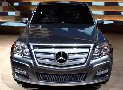
Mercedes GLK
Last Updated:

It doesn’t look any better “in the flesh”.
A crappy design is a crappy design, no matter what.
They should be ashamed of themselves…..

Last Updated:

It doesn’t look any better “in the flesh”.
A crappy design is a crappy design, no matter what.
They should be ashamed of themselves…..
The GLK has love-or-hate looks; The main problem with it, it’s that it’s just too flashy and “cheesy”… witch has started to become a trademark with Mercedes, lately…
Awful, heavy-handed design. “Cheesy” is the right word. The grille is also very similar to Acuras SUV, which is equally as bad but at least they were first. Mercedes should not be copying downmarket brands’ design elements.
Ugly but better than the Honda Pilot.
Even the Chinese won’t copy this!
So, this is the new Mercedes BLK (for “Block”)-Class
I actually like it….
What’s with the Acura grill?
Wait for this to show up in a teenage rap video.
That Merc logo is supposed to be bling enough to make it all OK? I don’t think so. I love the G-Class, known for two decades in Deutschland as the Geländewagen, but this pulls from the wrong design themes of that vehicle. I imagine it going something like this.
“Oh, ja. They like Der Geländewagen. Der Geländewagen is ‘Bling’. Der Geländewagen is also ‘Boxy’. Designers, we want you to do ‘Boxy’. But not too much. Ja?”
“Ja.”
“Sehr gut.”
…
Scheiße.
the penzer tank is back!
It looks like a Tundra.
I don’t think it’s ugly at all
It’s different and I love it…
Why do we have to expect everything the same…what’s common…
The design is crisp
A beautiful car design is like pornography, it can’t be defined, but you know it when you see it.
Trust me, this ain’t it.
Mercedes copying an acura grill and a kia body….what! for shame Guenter, for shame Rolf, you vill pay for dis indecent representation of da Cherman people.