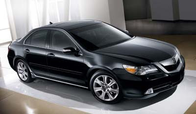
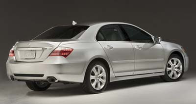
20099 Acura RL
Last Updated:


This doesn’t looka ll new to me. So I guesss the “new” RL is just the same car with a new front and rear design.
Plus the new 3.7 Liter angine and we’ll have to see how “new” is the interior.
I always thought the RL was a really nice car. With a great interior.
But what the market was asking for was more room (It was almost the same as the TL) a more distingtive design and a lower price.
At around $50 000, it just doesn’t compete with many $40 000 cas that are as good or better.
So the design is still boring and I can’t see how they could have made the interior roomier without redesigning the whole thing…
They have noew 3 versions of the car. Kinf=d of like Infiniti with a couple of packages. So maybe they did drop the base price (while offering less standard stuff).
I think this car is really not what Acura needs to compete in the segment.
They might push them out with better lease prices they have now. But really.
This is more than the Infiniti M and about as much as a Jaguar XF.
Good luck….

i don’t think they improved the look of the car at all. the rear looks too much like the new accord + the previous generation lancer while the grille is very, very Saturn-esque while the headlights are really close to the new Saab ones but without the chrome eyeliner. I understand there are design trends and certain elements will appear on a variety of cars…but this new RL is just not a good design – everything looks imitated and tacked on…from less expensive cars. But then again, I’m not really a fan of Acura’s edgy and overly busy new design direction.
Good lord, but that grill looks like it came from a steam locomotive.
whoopty friggin’ do
“we’ll have to see how “new” is the interior”
Compared to the current RL, the “new” RL’s interior isn’t new at all, just a rehash of the current interior with some new trim pieces. So basically Acura’s “new” RL is just warmed over a bit.
They have succeeded in one thing: taking a perfectly handsome car and making it grotesque.
Jesus frikn Christ, what on earth do they think is accomplished with that awful grill shield and deformed trunk lid? Idiots.
Looks like an Astra.
OMG, the front is as bad as it gets.
This does not surprise me at all. Honda is loosing its touch with design. Its most recent offerings suck. I mean damn! Did you see the Pilot concept ladt month. The CR-Z concept was cool, I admit, the honda Accord Sedan (SuCks!) the coupe is hot! So this brings me to Acura. When the previous Rl debuted it was a gorgeous car. this facelift sucks! It could have been a lot better. The RL definitey needs to grow in size, more upscale it should compete with the LS. But this is a car with no soul, its lost. If this is a sign of future Acuras to come…I say they are in trouble the MDX and RDX can’t carry all the sales.
A complete waste of money. Wow they made the Accord look worse. I cannot believe people get paid to design something that atrocious.
Looking good. All they need is bigger and more attractive 19 inch wheels. The current model uses standard 17 inch old fart ones (optional 18″.) The front and rear seem better to me, at least from these angles. The only reason this car has not made it is because the “country club crowd” wants a V8. Little do the
they know that “if you have a big …. you do not need a V8.”
the infiniti M is the best car that Popular Mechanics “EVER” tested. did you hear that, “EVER” all cars made , yes including rolls royce, mercedes, bimmer, and All japanese brands, not toyota, not honda…..NISSAN, the best car “EVER” tested….mull it over and enjoy!
20099!?!? Man they really plan ahead. Good to know we’ll still have gas 18091 years from now 😉
Vince… how drunk were you when posting this entry? Or do you need a new keyboard? LOL…
20099? Kinf=d of like? You must be drunk… MORE BOOZE!
Honda needs to do something with their design team. Looking at the Chevy Traverse, their car looks much more sculpted. This IMHO is much better looking than anything Honda has put out and I must say that I am a Honda owner and fan but the junk they have been putting out lately just don’t cut it. Check out more picks at Car Connection. Nice design.
I think Vince was crying and typing at the same time, but the lad needs auto spell check like the rest of us.
“Truth is said…
the infiniti M is the best car that Popular Mechanics “EVER” tested. did you hear that, “EVER” all cars made , yes including rolls royce, mercedes, bimmer, and All japanese brands, not toyota, not honda…..NISSAN, the best car “EVER” tested….mull it over and enjoy!”
Did you honestly take a car review from Popular Mechanics seriously? That is like basing your future car purchase on Vince Burlaps personal opinion which I value as much as …. Well, whatever.
The RL desperately needed a refresh and I think this is an improvement over the old car. They have a fantastic base to work with, it is a shame that this vehicle hasn’t been a success because it really is a fantastic vehicle.
Man, they really ruined the looks of this car. The previous one looked really nice but this one….yeeesh! This thing is HIDEOUS from the outside. Inside is really nice though. What’s going on inside Honda and Toyota, they are making some fugly lookin’ cars lately.
sebring headlights
The front end is the child of an Aura and Legacy….not what the RL needed.
Personally I think they went overboard to the extreme with this refresh…the only thing that mades sense are the shape of the taillights….they use the new design direction of all the other vehicles…
Head/taillights look like origami. If the grille were narrower, that bar would resemble a Hitler mustache. I bet it’s a great car but they can do so much better.
2008 Honda Accord mates with previous generation Mazda 6
yes i did, how do you like working at honda or toyota??, that would be the only excuse for your ignorance. The M by nissan/infiniti, the best car “EVER”
This vehicle give new in depth meaning to the term “butt ugly”.
yes i did, how do you like working at honda or toyota??, that would be the only excuse for your ignorance. The M by nissan/infiniti, the best car “EVER”
Get over yourselves, this is just fugly, and the M is looks like and old saab and is boring as hell.
This is shockingly awful. Like a bad joke. The M, for that matter, has a fat rump, invisible style, and sells poorly. So I guess that the opinion of Popular Mechanics doesn’t carry much weight. To compare the M to the RL is appropriate… they’re both dogs. This is a tough segment. One that there aren’t many good choices. The 5 series is probably the most popular. But it looks like it’s wearing transvestites glasses and has plenty of steering and ergonomic issues. The A6 is sharp, but the new A4 is almost as large now and the A8 is just sumptuous. The E class is the standby, but you’d only consider it if you MUST have a MB. The GS is afflicted with the same whale like proportions as the M. The STS doesn’t have the snob appeal it needs. So, by virtue of it’s distinctive ugliness, maybe the RL has a decent shot. What do I know?