The Monster
Last Updated:
They turn what was an OK but boring car into a monster.
All it needed was a $10 000 price drop.
Let’s hope this is a flop, for the sake of all the good taste that’s left in the world….
Last Updated:
They turn what was an OK but boring car into a monster.
All it needed was a $10 000 price drop.
Let’s hope this is a flop, for the sake of all the good taste that’s left in the world….
You are a dreamer, where do expect to find that REST of good taste that is left in the world? Let me know.
I don’t think it’s that bad. The front of it makes me think it’s a Transformer or something. If they redesigned the grille, they could salvage the whole design in my opinion.
Kiss me with those big momma lifs honey! Just a little more callogen and the auto world immitates Hollyworld. Whats with Honda and Acura with those ugly grilles? Did they hire Chris Bangle?
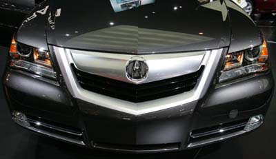
Why the Heck would you put a big garish suv grill on an otherwise nice looking car? Is Honda trying to kill off this car or something? Who comes up with this crap?…Worse yet, who signs off on it and says, “you’re right, this does look much better.” Don’t get me wrong, I was never in the market for this car. It was out of my price range. I always thought it WAS a nice looking car though. So in reality my opinion does’nt count as far as Acura is concerned. But I agree with Vince, had they left it looking the same, improved some reliability issues with certain pieces of equipment and dropped the price $10,000 they’d probably sell a bunch more of them and still make money off it. UGH…someone pass me the Pepto.
this may well be the ugliest car ever
Is that a snowplow?
Is that a snowplow?
I agree. The front/grill is hideous but the backend is passable. It is way too expensive as well.
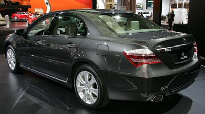
they even screwed up the Bangle trunk
Honda has lost it’s mind.
why would acura call a luxury car the monster???
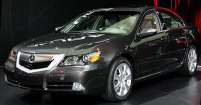
The Late 90s Early 2000s Q45/XG 350 separated reverse lights are excusible….but the angle of the 2nd picture looks exactly like a sebring minus 80% of the chrome.
It’s the grill I can’t live with, but for MMC is not that bad.
WTF?!
That grill looks like it could hurt someone! The back almost looks like a direct copy of the 7 Series.
Is Honda hiring Korean or Chinese designers? This is perhaps the clumsiest, most disjointed design of any modern car that I’ve seen. The way the rear bumper cuts into the tail lamp makes it look warped from the sun. The front grille resembles a kid’s lips that are red from sucking on a popsicle. I think that the Aztek, the element, the first gen Azera and the Ridgeline can now pass the ugly torch to Acura. This is really bad. So bad.
I feel like I was just poked in the eye! In fact I’d rather BE poked in the eye than look at this thing!
Makes me think of that guys nose from Digital Underground. I once got busy in an Acura backseat.
Attention Clark Griswold… your vehicle is ready.
Is Honda hiring Korean or Chinese designers?
Probably better if it was. The car was design by Acura Design Studio in California.
Is Honda hiring Korean or Chinese designers?
Probably better if it was. The car was design by Acura Design Studio in California.
I just threw up in my mouth a little.
I REALLY hope the new TL will not be this ugly… ?
I’ll take my Genesis…kk thx
“Probably better if it was. The car was design by Acura Design Studio in California.”
Clearly they’re the kind of designers that only talk to each other.
Drunk designer #1 “What this car needs grafted on the front… is LIPS!!!”
Drunk designer #2 “Yeah! SILVER lips… robot lips!!!”
Drunk designer #3 ” We need to make the rear end UGLIER than anything Bangle has ever done.”
Designers 1 & 2: “Whoah now, not uglier. Just really damn ugly.”
Designers 1, 2 & 3 “Bottoms UP!
this is no t an america n design you need to get straihgt with your facts kids acura is from japan and this is a ggood exemple of how usa produce much bettter designs that this www2 looking crap
any thing made by cadillac or lincoln will kill this