2009 Acura TSX
Last Updated:
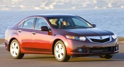
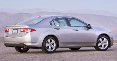
Nice car. But it’s really for someone who doesn’t want to get noticed.
Nobody will see this except owners of the current model.
I guess fear was at the head of the design team on this one…

Last Updated:


Nice car. But it’s really for someone who doesn’t want to get noticed.
Nobody will see this except owners of the current model.
I guess fear was at the head of the design team on this one…
I will tell you exactly what this looks like, it looks like lunch for the new Max. That New Maxima is sooooooo much nicer than this big accord, I’d love to see a comparo!
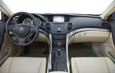
Looks like they took the Accord’s overly busy dash, closed up the unsightly seams, slathered on some more cheap-looking black and silver plastic and stuffed into the TSX’s interior. Inside and outside the new TSX has a dull ugliness to it. The current TSX has more slyle than this one. Certainly not worth whatever Acura is asking for it.
A few comments. (1) BORING, (2) the dash is way to busy, (3) BORING, (4) I see the ugly photoshopped grill picture I did as a joke was used by Honda as a design inspiration, (5) BORING! Christ, first the hideous shnozz on the Camry, then the handnail headlights on the Maxima, and now a TSX grill that makes a face I want to kick in. How difficult is it for these “designers” to have any taste?
This car was never meant to compete against the Maxima, so I doubt they’d care (BTW, the Maxima’s back looks like a Civic to me).
The car looks nice, especially the interior. The grill would be the first mod, tho, that’s for sure.
No more touchscreen, sigh…
The prev TSX was a great package, this one should continue that hopefully, I just wish they didn’t do the knob.
IMO this car may be more conventional looking than the Maxima but at least it’s not as awkward.
As a owner of the current model, I’m happy I bought the 2007 model instead of waiting for this to come out. Current model has much sleaker lines on the outside, though I think I prefer the new interior.
What’s up with the grilles on sedans lately? This thing looks like it has some crazy silver collagen lips. The rest of the car doesn’t look all that new… which isn’t to say that’s a bad thing. But those lips!
This actually seems like a more classy (if a little boring) take on the Acura design language. Its praportions fit alot better on this small sedan than Acura’s larger offerings.
Someone at Acura needs to be told that the flat plate grill idea is ugly.
I am reminded of my civic when looking at the front for some reason…
My civic is far sexier than this. And it doesn’t have that ugly grille.
My old 1992 Toyota Camry looks more modern and updated than this long in the tooth design and I really can’t stand the new Toyota designs either! This is a sure sign of ‘Devo’ or devolution for the current things to come in the automobile industry future trends. That back square tupperware bumper was chiseled out of stoneaged bedrock!
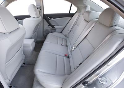
wow, that back seat could be out of a focus, or a versa, or an echo, well done accurate
I like it better than the old tsx, but it still is kinda boring and ugly. The dash is basically the current TL dash with little changes.