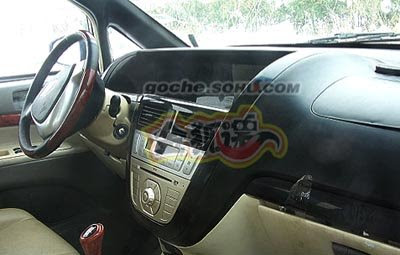
Chery B13

Last Updated:


We’ll never see this here. But still, why not show what they’re doing.
It is really close to the concept version they showed a while ago. So I guess that wasn’t really a concept in the 1st place.

Conversation 7 comments

  1. Cool … I’ll keep an eye out for this the next time I’m in Shanghai. I’m guessing the photographs are of a pre-production vehicle given the obvious (and awful) fit and finish problems: the burp in the passenger side airbag cover, the misalignment of the front and rear passenger door handles and the massive panel gaps on the A pillar.

  2. As much as I hate the avalanche of Chinese vehicles these days… this one is at least mildly original and cheapness aside, that is a nice interior.

  3. it resembles a toyota Noah, but that said, it is difficult to differentiate was is basically a box.

  4. seems very similar to the Chrysler town and country note the steering wheel and the front profile

  5. Ugly as hell on the outside, but the basic dash design is not too bad. The comment above about poor families is more than a bit arrogant. Not everyone on the planet has the money to blow on a high priced car, so thanks to Chery (or Tata) for trying to give these people an affordable form of transportation. Then you have the set of people that I am fortunate enought to be part of that can afford a wide array of luxury cars but chose not to simply because I don’t care what others think of me, and some manufacturers (like Suzuki with its Kizashi) will offer us a fair bit of performance, style, and a quality accessory level for under $30k, but hey, you people can delude yourselves that you are cooler till the sun goes down.

  6. Anyone see how the door handles Don’t align between front and rear doors? Anyone else see the “aibag” cover on the passenger side, how it looks like it is peeling upwards on one side/sticking up on the corner, above the dash?

Leave a comment

Your email address will not be published. Required fields are marked *