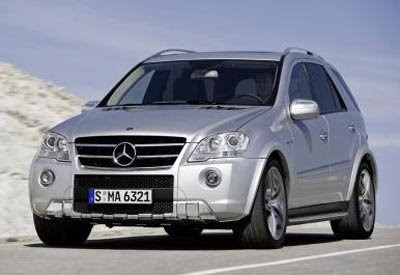
Facelift for the Mercedes ML
Last Updated:


What the hell is wrong with these people???
The ML was a fine looking car/SUV/crossover . Now they modified the front end to keep it more in line with their latest monstrocities like the GL and GLK.
it looks like the horror show will keep on going at mercedes. Wait till you see the new E class interior.
It also is inspired by the GLK.
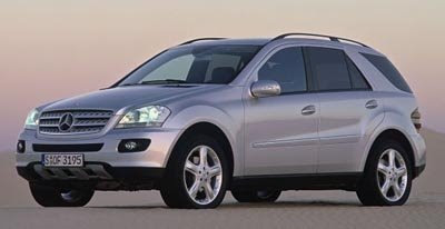
Here is the current model. In case we forgot what a good looking Mercedes can look like…

Conversation 7 comments

  1. Vince, you didn’t mention that the first pick is of the new AMG ML, not the regular one. The regular version gets updated too and it does look much better inside and out. Why MB keeps making their AMG’s nightmarish/garish doesn’t make sense to me either but the least you could do is mention what version we are looking at in the first picture.

  2. I personally think the ML was and a pudgy, ugly doltmobile. It can’t go away fast enough IMHO. That being said, this front end has a bit more aggression to it, which is a good thing.

  3. Vince, just because it isn’t boring like you tend to like things doesn’t mean that it isn’t a good design. This is one of the best selling SUVs in the WORLD and it will stay that way because of this refresh.

    Are you basing the ugly comment because of the ML63’s front bumper? That isn’t that they all will look like.

  4. The current one looks good, but, kind of meek and old fart (appropriate for MB’s clientele.) I think, the new facelift makes it more aggressive and in line with recent BMW and AUDI facelifts.

Leave a comment

Your email address will not be published. Required fields are marked *