BMW 7 Series
Last Updated:
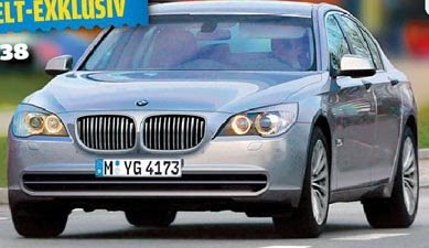
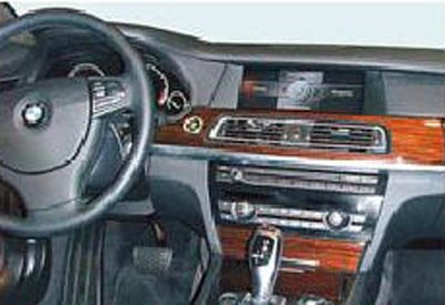
These look pretty real to me. Especially the blurry interior shot.
Again, nothing special. You’d think that much money would get you something that sands out, a little bit…
Last Updated:
These look pretty real to me. Especially the blurry interior shot.
Again, nothing special. You’d think that much money would get you something that sands out, a little bit…
Slightly more aggressive than the putz-mobile 7 series currently polluting the roads, but it will likely be as effeminate as the new 3 series, which means the 7 series, like all bimmers these days, is intended for the soccer mom crowd.
Wow – that dashboard reminds me alot of current US model Honda Accord in terms of the overall layout, and shapes – especially the placement of the NAV screen. It’s a fuzzy picture, I know – but I’m not wild about it for a car in this class (I’m not wild about it in the Accord either).
If this is real it better come with a significant price cut. Lightyears behind its competiters in terms of style. I’d prefer the Acura over this. Now excuse me i have to go take a nap.
The dashboard looks like an accords dash, because Honda copied bimmer, not the other way around. That being said I’m quite disapointed in the way this looks. I hope my disappointment is trim specific. As for the exterior, BORING! Maybe they designed this before they created the CS. I think the majority of buyers will wait till that beauty comes out.
I guess they tried to make it simple for seniors
and the young generation who is too afraid to consult
a car manuel. Maybe this is a Chinese knock off.
That much money should get you more than a 3-Series interior. The S-Class looks like a Maybach or Rolls compared to this interior. Sure it’s blurry, but it just looks cheap.
Maybe it’ll have more curb presence once we see it in person. But it doesn’t look very stately or contemporary. It’s the Buick Lucerne of Bavaria.
This is a chop from AutoBild, is it not? Lord, I hope so, because this is terrible!
the two pictures are different. Look at the i’drive screen “hump” on the top pic. It is much larger than that of the bottom
To: Uselesssperm
I wasn’t implying that BMW was copying the Accord. I’m certain this was long in development before BMW would have seen the current Accord. I also acknowledge that the Accord is obviously influenced both inside and out (for better or worse) by the current 5 series. The Accord’s dash was influenced by the 5, and moved it in a specific direction. The middle and lower portions of teh Accord’s center stack look very similar to the 5, but it doesn’t have the huge bulge at the top to accomodate the NAV screen. The new 7’s treatment is closer to the way Honda integrated the screen. I think some car manufacturers have had a challenge cramming more and more crap on the dash – especially the NAV screen. I’m in the maret for a 128i, and will likely get it without NAV just to get a cleaner more classic dashboard. I think Audi/VW and perhaps Volvo as well, have had better luck with this – although I prefer the previous A6 dash to the current one, which is far more massive.
When did everyone become too stupid to find their way around without a navigation screen? This is exceptionally disturbing on “the ultimate driving machine.”
BMWs are great handling cars and carry excellent prestige but they are getting more ugly all the time and everybody except BMW hates that IDrive crap.