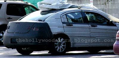
2010 Chrysler Sebring
Last Updated:

Chrysler announced a few months ago it was already working on revising the Sebring (And Avenger) because of slow sales . Well… duh…
Anyone with half a brain could have told them these cars weren’t going to be major hits.
They just needed a small 300 . This would have been a hit.
From this picture taken a few days ago, I don’t really see any major changes. I think they might be concentrating on the interior.
There isn’t much they can do until a full redesign.
New tail lights and front end won’t turn this car into a model…

And that old Saturn Ion rear door and roof line is sure to help sales.
let’s hope they at least either get rid of the hood grooves or have fewer of them (2 might actually be ok)
and wish they could modify the C-pillar – even if it was just tacking on a piece to make it look less stubby and more flowing
You missed one obvious change — looks like the C-Pillar has been redesigned to eliminate that goofy panel.
Vince, maybe your wish for a small 300 will happen… I read somewhere that Chrysler wants to transform the Sebring/Avneger into RWD. That’s a start…
While they’re about it, they ought to get rid of that ridiculous grooved hood on the Sebring – one sure doesn’t see people lining up to buy that.
A totally revised interior (with much higher quality materials) would definitely help this car. IMO the exterior styling is bad but not Aztec bad. Some changes might actually help.
But Vince, you are dead on right, they should have designed this car as a Baby 300. If they had, a cheap interior wouldn’t have stopped it from being a decent selling car at the very least…
Too bad Chryslers CEO is spending his time pissing off his top designers (such as the head of project Genesis) and driving them away.
Why even bother. If they are not going to address the problem then what is the point. Unfortunately for them the problem is the entire car.
The Chrysler Sebring has the ability to depress me whenever i see it. I truly just don’t understand how a group of professional engineers and designers came up with it in the 21st century.
And you just know almost every copy on the streets will be beat to crap in a few years because of the kind of buyer it takes who would actually choose it over any of its competition.
When the current model came out an article I read quoted the design team as saying that they tried a “mini-300” but because of proportions it just didn’t look right. The current model has just about every single styling miscue possible. It looks like one of those “morphed faces” where features from about 10 people are combined and extremely ugly. Frankly I can’t imagine any rework on the current shell will look any better. The dies should be crushed and start over.
I’ve gone with more expensive rental car agencies in the past just to avoid short-term exposure to this hideous piece of automotive crap.
A bunch of goof-off MBAs thinking they know how to engineer a car…Chrysler is dead.
The ridiculous “C” pillar painted (or black plastic overlay) made to look like a quarter window is a dumb styling idea that never should have started in the first place. But assuming the Sebring wisely drops the painted “C” , Mazda seems to have taken over with its otherwise good-looking 2009 Mazda 6 sedan with………..yep!……a dumb, painted-in rear quarter window. Phooey on this bad design!
this is already one fo the best car you can get for an american family i hear its a hit in europe too doing better than the local crap they have over there
there is no need to change anything
It took them long enough to tweak this thing…
there is no need to change anything
Tell it to Chrysler’s German owner.
When will the 2010 Chrysler Sebring be on the market?
When will the 2010 Chrysler Sebring be on the market?