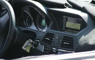
Inside…

Last Updated:


The next Mercedes CLK Coupe.
It seems to follow the blocky trend we see in the GLK and the next E Class.

This seems to unattractive to me. It reminds me of horrible 80’s designs…

Conversation 7 comments

  1. That’s just nasty, and I mean that in a BAD way! Cadillac’s interiors are much cleaner and have a higher quality look to this Chrysler reject! Unbelievable!! I’m sure the rich snobs will buy it anyway because it has the 3pointed star!

  2. This very basic. It appears to be less impressive than the interior found in an Accord. The interior in the new Lincoln (MKS?) is more contemporary. I would be impressed if this were a Hyundai, but people expect a lot more from Mercedes. The way MB designs are going, Audi, BMW, Cadillac and Infiniti are all quickly pulling ahead.

  3. I have a current CLK (Im not in love with the interior of it either) and this is years behind anything else on the market. I don’t like this at all. Its just plain ugly. Much to sharp and block. They’d do better with the pop up nav as in the c class cars. This is just plain wrong!!!!
    T

Leave a comment

Your email address will not be published. Required fields are marked *