2010 Ford Fusion

Last Updated:


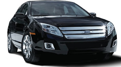
This illustration does look like the spy shots.
Unfortunately…

The current Fusion’s front end is the best part of the car. So changing it is a weird move.
This looks like a cartoon face.

Conversation 15 comments

  1. imho not the best “illustration”…
    (tho thanks for posting it, Vince!)

    …can’t wait to see the real thing

  2. PLEASE tell me that this illustration is just that…an illustration. I just looks as if the current headlights were streched to the new spaces. There is no way this is the final headlight design, that would beabsolutely ridiculous.

  3. This looks better….but uuuhhh…weirder too. I can’t put my finger on what’s wrong…it’s just really weird looking. Maybe the grill is too tall or the bars are too fat or both or…… I am looking forward to seeing it in person. Also, did they change the interior too? If so I’m looking forward to seeing that too. I thought the old interior looked good with 1 or 2 exceptions so I expect the new one to kick arse. I really can’t wait to see the new Milan and also the Taurus too.

  4. This is definitely not the real thing. For one, the ford emblem on the front is squished and flat looking, and secondly, this doesnt follow the rendering shown a year ago. Btw, those are MKZ wheels.

  5. This looks more aggressive and makes the car look fast, even though it may not be. I thought the previous front was a little stiff. Agree with poster who said a better 4 and little more upscale interior.

  6. I like the fusion, but I’m not so sure about the Camry inspired headlight angle. From headlights to mouth of the spoiler, it has that same anime superhero smile of current Peugeots.

  7. ARE YOU KIDDIN ME PEOPLE!?!!?? THIS IS JUST ANOTHER ILLUSTRATION! YEAH THEIR SHOWING A NEW GRILL AND FRONT BUMPER, BUT ALL THEY DID WITH THE HEADLIGHTS IN THIS “ILLUSTRATION” WAS STRECHED THEM OUT, KIND OF LIKE A DISTORTED IMAGE

Leave a comment

Your email address will not be published. Required fields are marked *