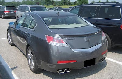
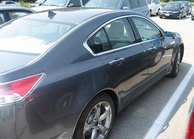
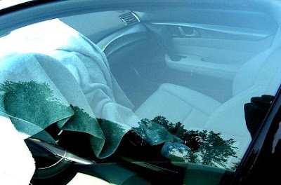
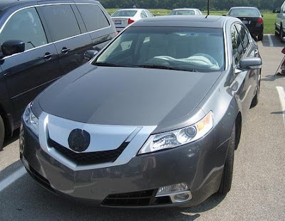
All new Acura TL pictures
Last Updated:
To me, this is still trying way too hard to be different. But in a cheap way. Basically using weird details in what is mostly a pretty boring shape.
Maybe it does look better in real life.
Remember a couple of months ago when we heard about this car from a dealer meeting. The one where they were describing what they saw as “stunning”…….
Interior seems good but I think the cars exterior looks waaayyy better with the camoflauge left on it. Hey Acura, you may want to offer camofauge as an option to your customers.
When the second generation (1999 – 2004) Honda Odyssey minivan was released I wonder if anyone expected its angular lines and pentagon shaped grill would become major design themes for Acura. While certain aspects of this new TL are appealing the massive chrome grill is absolutely comical … and having the bottom edge of the trunk mimic the lower profile of the grill is too obvious (something more subtle would have been better). I’m sure this will be an excellent car with good performance and beyond reproach reliability. I just hope Acura can find enough buyers confident enough in themselves not to be embarrassed by being seen in a car in such obvious need of rhinoplasty.
Yikes. Couldn’t Honda make the grill bigger? Maybe wrap it up the hood to the windshield. It’s just not gaudy enough.
My gawd! That grill is an abomination. It looks worse in these pictures. What was Acura thinking? Just brutal.
Wow, take a good looking car and just destroy it. The back looks like toyota, which is never a good thing.
malibu/new lincoln….seen it…won’t do it! New Maxima is unique and sexy
Malibu does not compete with this car or the maxima.
And the Maxima is hardly unique.
Let’s wait for better pictures. These are just too close up. Can’t tell what the hell the car looks like. Sometimes you wonder who are these bozos taking pictures from these angles. Like those stupid car show videos floating around in Car and Driver showing details of the headlights or fenders but not THE WHOLE CAR. Having said that the TSX looked good on pictures too, but, when I was servicing my MDX( not with the weird grill)the other day, I was not as impressed with the grill. Same goes for the RL. They are trying to differentiate the brand in a crass way.
I think Acura intentionaly dumbed down the TL styling to support the RL sales.
The grill and hood design seem like an afterthought. I think they were trying to mimic the Cadillac egg crate grill. It lacks the integration of the headlights.
The rear license plate should be placed in the center trunk lid between the rear lights and the quad tailpipes should exit in the center black hole of the bumper.
What seperates a BMW design that other manufactures try to emulate is just the small subtle details. The soft sculpting of the bodywork panels, the intergration of the seams of the headlights flowing into the hood into the roof down the trunk incorporating the tail lights, and the small amounts of chrome trim.
Acura should just pay the Chinese to design their cars.
You can see the uncamouflaged TL ’09 grill on Acura.com (just click on future vehicles).
And I just noticed that indeed the front grill extends over the hood… Although that angle is a bit better.
That looks good. Its someting different.
If car makers had to design a car that everybody liked, the car would look so familiar, like something out the 80’s and 90’s.
Welcome to the future.
Anyone else notice the two foglights on each side? WTF are they thinking?
Evidently the 90’s were the high point of Honda design. YUCK!
I dont think it looks great either….. but i also wasnt sold on the new maxima…. UNTILL I saw it in person…. I was recently in NYC and saw my first new maxima in person….. wow!!! it is stunning
I hate it.
Infiniti now has a new customer!
Acura has a habit of taking a great drawing and poorly executing it into a real car — check the old sketches of the RSX and compare them to the production car. I’d bet the TL drawings were amazing, and like the RSX, that was lost in translation.
I really don’t get it. Honda’s design studio is hitting home runs (Accord Coupe, Civic 2-door, Element) and Acura is cranking out this. They are the same company, right?
No matter what, people will still buy this since it is more or less a Honda.
This scenario remind me of a scene from Tommy Boy, people don’t care what is in the box, but as long as there is a name on the outside, people will buy it.
And the said thing was that the manufacture knew that what was inside the box was sh_t.
The TSX has grown on me after seeing it on the streets. I don’t know if this will have the same effect. The Grill looks really bad on this and what with the chrome bar on the trunk looks stupid. The Infiniti G35 has has the a stupid chrome piece on it trunk too.
paint the grill to match the body color, and that “toothed” look might go away – other than that, it is what it is, an accord that doesnt look like it got in a (styling) fight (and lost…).
vince you have no knowledge about cars, the maxima competes and beats this friggin pig, grow the F up!
At least its something different.
Not neccessarily in a bad way.
We need to be more receptive to change.
Too many angles. Maybe this is what Bruce Wayne drives when he is not Batman.
Just when you thought Honda styling could not get worse . . . along comes this big turd with that horrendous grille
The Maxima and this new TL are almost identical in profile.. but the execution of the front and rear ends couldn’t be more different!
The Maxima is beautifully executed from the front.. it looks nearly a foot wider than the previous model, with a very distinctive low-set, wide grille opening that looks almost menacing.. and viewed from the front, the rear fenders swoop out almost Porsche-wide! There is no mistaking it for the Altima anymore, but the rear end is a little bland by comparison.
When the Acura dealers called this new TL “stunning”, they might have meant it the other way… stunned that their volume seller had just become a parody of several Lexus models.. and of itself!