2009 Jeep Compass/Patriot
Last Updated:


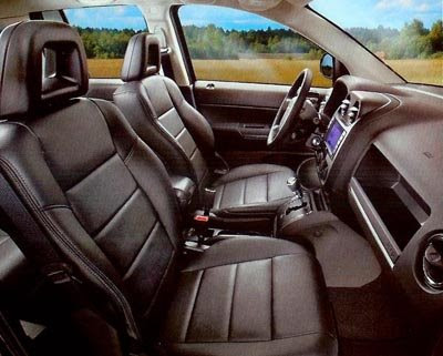
This is the new interior they were talking about a while ago.
At least on the picture it looks much better. I guess nothing could have been worse than the current one…
I still think they should drop the Compass.
The Patriot at least looks like a Jeep
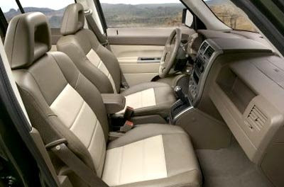
The current interior, one of the worse around. From anywhere.

Conversation 7 comments

  1. The Canadians seem to like
    the Compass.
    One thing about the Compass/Patriot
    I can’t stand is that cheap arm rest that looks like it was sold at Toys R US. Also, those 1980’s Audi/VW headrests aren’t my favorite, so I hope the cheap feeling of old is gone. And I wasn’t a big fan of seeing the car seat tracks upon entering the vehicle.

  2. All crysler has to do is boost the material quality in the interior. Won’t take a lot of effort.

  3. It doesn’t look significantly better- plastics abound, except the interior is of a darker color.

  4. The Patriot is one of the worst vehicles I have ever driven with the worst interior ever designed.

    I had one as a rental on my last business trip to CO and I dreaded driving it. The CVT was terrible and you could actually see the mold lines on the dash from where it was produced.

  5. It appears that they’ve done a lot to improve key areas without putting it through a total redesign. I’ve rented these before, and there’s no way that you can look at the steering wheel, the 80s air vents and center console and believe that this isn’t total junk. Chrysler was wise to address these critical areas in such a volume vehicle.

  6. I see much softer, molded shapes and better detailing, but I doubt the actual plastic is any less rigid and tacky than the current pieces.

Leave a comment

Your email address will not be published. Required fields are marked *