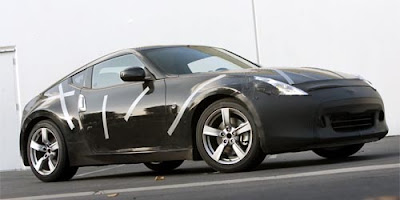
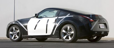
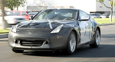
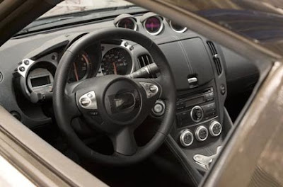
All new Nissan Z

Last Updated:


With almost no camouflage.

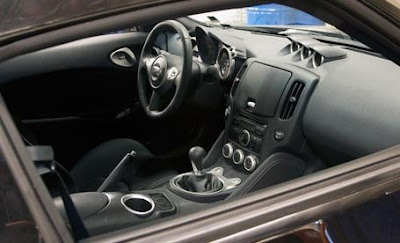
The interior does look like a step up from the current version.
I never drove the current model, but always liked the design.

I will be testing it (The 2008) next week. To see for myself.
But this new one looks much more aggressive.

Let’s hope they keep the prices down as well.

Conversation 8 comments

  1. I see that they didn’t get rid of the dumpy SubZero style door handles, but they added the garish Poke Mon headlamps, the worst element that could have been carried-over from the Maxima. That gargantuan lid on the dash looks like a kitchen trash can and the CD player below it is the same Sparkomatic system that I had in my 1980s Quantum. The vertical air vents resemble those from the STS that everyone criticizes. I’m sure the material quality is better than the current one (couldn’t be worse) but it’s a nasty cobbled-together design. The G37 is so sweet, and this is just a Barbiemobile.

  2. the black tape on the headlites made them look better ! and wow navigation takes up 80% of the tacky dash now, so people can find there way to work daily and how to get home…

  3. Where is the spyking to tell us how he desinged the whole car?? Maybe his dad isn’t working and couldn’t give him any inside info. It’s OK Spyjester. Maybe you’ll grow up and actually work for Nissan someday.

  4. I’m not sure what’s going on with this interior. The exterior looks the same, dumpy. This is a modern Iroc Z.

Leave a comment

Your email address will not be published. Required fields are marked *