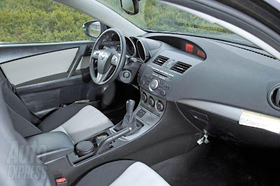
Mazda3 Interior

Last Updated:


The shapes seem pretty nice and modern. But this bad picture taken with a flash makes the whole thing looks really cheap and shiny.
I don’t know why anyone would use a flash when taking pictures of a car interior outside.
They do it all the time, and it always looks bad…

More pictures soon.

Conversation 7 comments

  1. I aggree. The design of the interior looks good, but the materials, in this photo, look cheap, even though they may not be. I like this car a lot and I hope it wont be too expensive or small.

  2. I like it even with the flash causing problems. Do hope the red backlights on the radio will be gone.

  3. well, it could be the photographer sets the camera on ‘auto’ mode, so the camera automatically senses low light and fires off the flash. it happens all the time.

    back to topic, it does look nice … however it seems like most makers are going for the two tier dash look, heh?

  4. LOL! markus hit it right on the head. Funny how everybody complained about the “double hooded” Civic dash, now the Prius and Mazda3 seem to have variations on the very same theme! My concern is where will Mazda put the Nav system now? That new hood display would be blocked by the current pop-up unit.

  5. People may be getting used to the double tier dash look and that may be why they’re not complaining about it. I know sometimes when I see something new that I don’t like, after time I find myself getting used to it, and then in some cases I start to like it. I know, I’m weird.

Leave a comment

Your email address will not be published. Required fields are marked *