2010 Mercury Milan
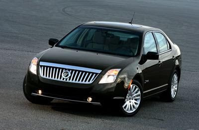
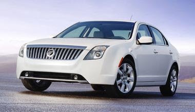
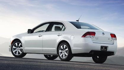
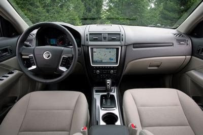
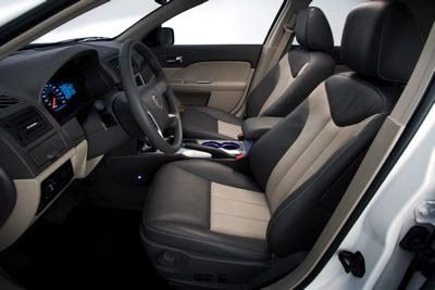
To me, this is a repeat of the same story. I think the Milan does look better. Especially inside. Even though the interior design is the same, the trims and colors used make it look much better.
That cheap looking piece of silver plastic on the Fusion dash looks really bad, at least on pictures.
The Mercury does look more upscale. And the rear end comes together much better than on the Ford.
Let’s hope the Hybrid model will put Mercury back on the map. A good looking car with what seems to be a killer powertrain.
They really need to let people know about this car.
