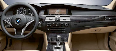
Next generation BMW 5 series interior???
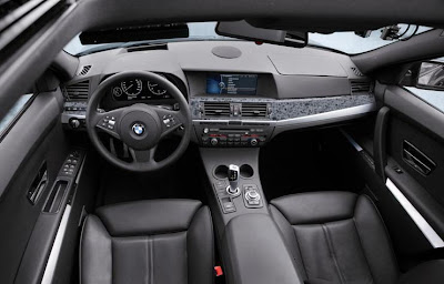
Last Updated:
It could be. (Top photol)
And it’s looking much nicer than the current model (Bottom) . At least it isn’t as flat looking.
With a “GPS hump” integrated into the dash.
And it also looks so much better than the new mercedes E Class interior….
It is a mystery to me how a brand that is known for such superior driving dynamics can have such boring looking dashboards. Infiniti could serve as a benchmark for BMW when it comes to building an exciting looking and feeling cabin. And what is up with the mosaic, kitchen sink look of the dashboard in the top photo?
Which is which? Because both of those are different.
New model = top
Old model = bottom
Couldn’t get worse.
those cup holders suck…..
Insanely hideous.
If a plasti-granite dash insert isn’t bad enough, then maybe the fact that there is still a dashtop airbag lid on the passenger side complete with a large warp in it like it’s been sitting in the 1990s sun for too long is.
BMW sucks in so many ways, but hey, everybody who is anybody’s secretary in L.A. drives one, so there must be something in building cars aimed at badge-prostitutes.
what’s with these fugly 80’s style interiors that the Germans keep coming out with?? And that granite countertop dash trim is bizarre. Hard plastics galore too (top dash and cupholder area)!
On the plus side, looks like BMW may be moving to OLED backlit displays?
This might be the V Series BMW which denotes
a crossover van type of thing.
thats actually the interior from the X1 concept
that is the interior for the X3
“thats actually the interior from the X1 concept”
That makes sense since it is far too cheap looking for the 5er…Definately an enrty-level interior grade.
The new one has a Honda Accord dash.
My friend just bought a 335 BMW, I was amazed at how simple and logical the dash was. There were buttons, but, definitely not over the top, it really nice to have it some simple and well layed out.
this was a design study
its not from an actual car
The angle of the picture made the cupholders look tilted and quite small and so close to the shifter.
There are a number of oddities with the design in the top picture, like the trashy looking “granite” and the single round dash speaker. The passenger airbag looks like something out of a 10 year old Toyota. New cars have no visible airbag seems like this.
you people know nothing about cars this is the interior the X1, concept, it obviously has been shown in other places more than once……………….not to mention Infiniti is conistantly trashed in regards to its cheap, low quality interiors that happen to look good, BMW cars have always been high quality, infiniti serves as a benchmark for no make……BMW is the reason why Infiniti is even still existance
Anonymous said…
this was a design study
its not from an actual car
November 29, 2008 1:27 PM
How do you know?