And now for the Coupe
Last Updated:


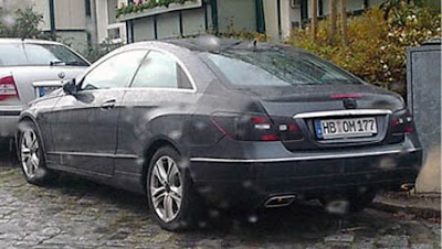
The mercedes E class coupe is coming up right after the sedan . Replacing the “old” CLK coupe.
As you can see, this is just a straight 2 door version of the sedan.
Kind of like the last Camry Coupe from the 90’s.
Just take 2 doors off and there you go: a coupe.

is that really enough?

Conversation 15 comments

  1. I think it is enough for mercedes buyers. They don’t look at the car – onlyb at the badge.

    If they actually saw past the badge at the design atrocities they waste their money on, they would at least look a little less stupid while driving to Starbucks to complain en masse about their husbands.

  2. A “straight” version of the sedan. That’s a bad thing? Remember the old E-Class coupes? Terrific, understated automobiles. I prefer this traditional coupe concept vs. the current Accord/Camry in drag style. Is this enough? At the very least you can’t tell from this picture.

  3. This thing is terrible. At least if your buying a Honda or Toyota coupe your only spending 25 grand for it. This thing is going to cost at least 55 grand. For what!!! Just so someone can say, “Hey look at me, I’m driving a big ugly MB”. Give me a break.

  4. Is that one of those dumb “C” pillars painted and framed by bright metal to look like a window that isn’t?

    If so, Mercedes blew it this time.

    Welcome to the Sebring School of Design.

  5. “…they would at least look a little less stupid while driving to Starbucks to complain en masse about their husbands.”

    That was a brilliant comment because it’s so true.

  6. As a former Mercedes owner, I don’t think it’s ugly per se. They’re clearly taking risks with this coupe…look at that vaguely triangular door handle surround! THIS is a Mercedes-Benz? Many existing CLK or C-Class owners might be interested in “moving up” to this new “zoomy” E-Class coupe.

    Now let’s talk about that rear fender curve. I smell Bentley Continental GT or ‘classic Merc’ lineage. But like the horrid S-Class fender flares (the kind of design move that works better on the new Mazda 6)…it appears messy and applique.

    The top of the taillight lens doesn’t align with the character curve from the rear fender…the hip line appears to start at the C pillar and get lost in the descending corner of the trunklid. This appears messier than the rear end of the previous CLK, however I still take issue with the taillight shape of the E, CLK and SL cars. That curve was too arbitrary. This Lexus ES/Honda Accord shape does make the car seem like the designers are catering to younger buyers. Not too much younger…but this car is intended more for the “new money” than the SL and the CL.

    I believe this might have some folks converting to Audi…A5/S5, anybody?

Leave a comment

Your email address will not be published. Required fields are marked *