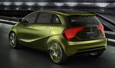
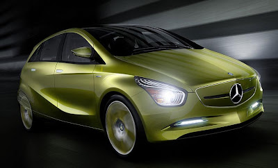
Mercedes “BlueZero E-Cell Concept”
Last Updated:
And one of the ugliest car designs I have seen in many, many years. Just when you thought these guys couldn’t do much worse with the MLK. They top themselves.
This reminds me of old Citroens from the 70’s. Or even the 60’s.
In a bad way.
And this is said to give us hints of what the next Mercedes A Class and B class might look like. The current B Class is quite a boring design. But the A Class is really nice and modern looking.
None of them nearly as offensive as this thing….
The front reminds me of the old GM “Dustbuster” minivans.
I hope bland comes back in style…Or designers who are older than 8
Vince…it’s a concept. Ease up. It ain’t that ugly. The back is actually pretty cool looking.
Looks like a Mazda.
When did Mercedes hire Chris Bangle?
mmmmmmmmmMazda…
This looks way better than the disgusting current A class any day. Not a fan of those stupid eyelashes in the headlamps though. They remind me of the retarded LED whiskers on the new Audis.
What’s a Mercedes ‘MLK’?
I can’t believe that no one has mentioned how the body side surfacing is a blatant rip-off of the BMW roadster.
Mercedes has totally lost the plot.
You’ve got to be f***ing kidding.. Another design abortion from M-B.
The rear actually looks like a BMW X3…not very original.
Absolutely horrible. Unoriginal and ugly to boot.
Flame on, Mercedes. Flame on.
LONG LIVE THE (AMC/DaimlerChrysler) GREMLIN! ! !
It has a lot of BMW and Hyundai styling in it, and they don’t look all that great, either.