All new Mercedes E Class
Last Updated:
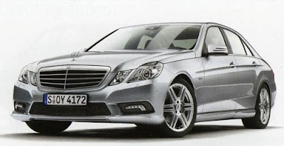
Well, there it is, finally.
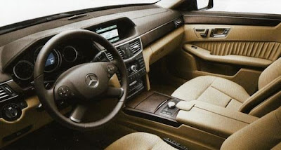
And actually, although it does not look great, I think the interior isn’t as horrible as some of the spy shots I’ve seen of it before.
But is it enough?
Last Updated:
Well, there it is, finally.
And actually, although it does not look great, I think the interior isn’t as horrible as some of the spy shots I’ve seen of it before.
But is it enough?
I can’t find a single attractive element on this car. It’s just ugly.
It is the E-NoClass
Nothing elegant about it…Hyundai Genesis is better.
why does all the recent merc interior all look like they are fro mthe 80’s???
Enough for what? To compete against the 5 series/GS/A6?Hell yeah. What’s so amazing about those cars? What’s lacking here? I don’t get your constant criticism for Mercedes. There is a market for solid driving, well built luxury cars that may not appeal to the 16 year old in each of us.
the exterior is better than i thought. all those spyshots made it looks like a hyundai genesis. however it does not really.
the led fog lights are a nice touch. the next step would be led headlights.
the interior is okay. it seems these luxo makers do copy each other. bimmer, audi and benz all have that second hood. the semi circular arc where the headlight knob resides looks a little cheap. the leather should be a shade lighter.
overall good try. a-
“But is it enough?”
If it has a Mercedes-Benz logo on it, sadly, yes.
It’s seems hard for an auto manufacturer to go down the tubes once their brand identity has been established. The only thing that would taint the car soup would be reliability problems. Even the bland and disgusting cosmetics of cars today don’t turn away business. Take Honda and Toyota for example.
Looks like the reused the interior of a 1987 300E.
This car for sure will have its critics. But The new E-class Sedan this time around may catch a different demographic. Why most europeans cars are gett wider and sleeker, MB is going the opposite direction. One could look at it as setting a new trend. Think about it will other small uts went to curves the GLK went blocky and to hard edges. Back to the E-class sedan, I see an older demographic falling for this car, you know like the ones who would drive a Cadillac DTS, Buick Lucerne, Toyota Avalon, Chrysler 300, Lincoln Town Cars. That could be a good thing thought for Mercedes. The upcoming CLS can feed the current demographic for the current E-class sedan buyers.
I do agree with you on the interior Vince, The interior isn’t as bad as i thought it would be, it actually came out to be pretty nice. And the exterior design isn’t all that bad, not the best or as sleek as I had hoped for, but its refined and it looks stately. This car gets a 6 out of 10 from me.
aweful looking thing
MB builts great driving cars, boring looking, and with reliabilty problems enough to rank them below average in Consumer Reports. Nothing new in these photos to excite me. Let’s wait for photos from all angles.
I actually like it a lot and I am more of a Audi fan…
In all seriousness, the 2010 Taurus is looking very good compared to this E-class. Oh wait, it doesn’t have the “prestige.”
Yeah, well, trying to buy prestige is the first resort of the emotionally inadequate who don’t command prestige or respect to begin with, and they never will. Thank God for them there is always credit available … oh wait.
Mercedes Benz has definitely lost their way as far as auto design. Maybe their influence is the reason the last few new Chrysler products have been so shamefully hideous.
I really like the exterior and MB’s latest chiseled design language. The interior is too generic. It’ll be suitable for German taxis, but that’s about it.
Good. I never wanted the interior of a Mercedes to look like a Japanese boom-box (I miss simple, serious styling). From this photo the exterior looks stately, which is a point of difference from the competition. With the momentum behind this car, and if Mercedes now remembers how to build them, it will be a winner.
Zzzzzzz
Best looking E-Class ever! (Excluding the Chrysler E-Class of the late'80s & early '90s). Not as nice as BMW 3 or 5; Cadillac STS or CTS; Lincoln MKS; Volvo S80; BUT– Definitly a HUGE improvement for Mercedes — and more than enough to keep it ahead of Lexus (though still behind Infinity).
Okay, I never liked the roadmanners of the Benz anyway (too comfortable for me) but except “wearing” the “star” I see nothing that makes too much sense to prefer this car to the stylish offers from Audi A6, BMW 5series, Cadillac CTS or Jaguar XF…
that car is really ugly. it looks old, like a restored old, ugly mercedes. what the heck. bmw is moving forward with style, merc backwards.
Ill be looking forward to riding in this taxi.
Yawn. Wake me up when the new CLK is shown.
i wonder what the real version will look like.
i know these are real shots, but the real mercedes is the unpretentious one with the smaller wheels (smoother ride), softer body sculpting, and typically a darker color. and that puckered leather on the doors says “old school class” like nothing else in the segment
it isn’t perfect, but at least this version doesn’t look too similar to older ones
It’s gorgeous… the front’s sexy, wish the same could be said about the rear… I’d pick a Merc over a BMW anytime 🙂
CHECK OUT BUICK INVICTA…IT’S WAY BETTER THAN THIS NEW E CLASS
I GUESS GERMAN CARS NOW SEEM OUTDATED…LACK OF DESIGN IDEAS…TOO CONSERVATIVE AND NO CHANGES
It looks like a korean knock off
THis car is much more Benz like in every way. It is elegant, expensive, sexy looking, heavy and will outperform the previous E Class. It will drive better than any stupid korean knock off or any genesis ever!
This is probably the AMG version (or AMG Styling package). The standard version will look even worse. Interior is really old and outdated. Maybe it looks better in a different colour…