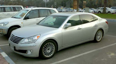
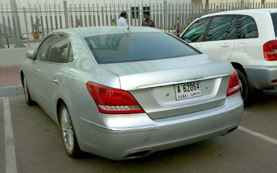
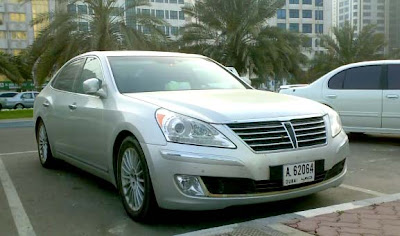
Hyundai Equus in the street
Last Updated:
Not sure what to really think of this one yet.
It still has a “cheap rich guy” look.
Not classy at all.
Unlike an Audi A8, or S class.
It seems to be showing off how big and expensive it is.
For a Hyundai….
Avalon II
They’re obviously copying BMW7 in back, Buick at the sides, and Avion in the front. Overall, they don’t have much of a “feel” for intuitive car design — and it shows. The whole thing is MUCH LESS than the sum of its parts. (Mabey they’re trying to fill an ugly niche at the top of the Subaru line — just in case anybody ever asks for an overpriced sedan that makes even the S-Class look presentable.) I think this new design is why GM’s stock shot up so high today!
There is something little weird about the way this car looks.
that uneven panel gap above the rear light is pretty poor
How so? To me, it doesn’t look expensive or very large.
it doesn’t stand out from the crowd or anything, but seriosuly, which car in the A8/S/7/LS actually stand out much from the others? and the proportion seems to be alright and it does look “big and expensive”. they need to start putting logo on the car thought, if they think a hyundai badge is not up to the task, they can design a mini-series badge like how the toyota badge their crowns series in asia
I really don’t like this, I really see alot of pre-facelift Audi A6 in the rear end and the front is too Lexus LS like. Hyundai seems to be taking its on-a-bit-of-a-role at the moment abit too seriously by releasing this piece of crap. Just stick to well-made great value cars that anyone can buy!
It seems to be hard to design a that has an identity and character. There are no designers like Earl, Exner, Mitchell,Teague or Loewy. What do you expect? Today they have design teams and A does the front, B the rea and C the side. Then they put it in the mixer and here you go. Poor world – but they are paying for wrong decisions and poor management now. Will they learn? Hardly.
Looks good to me. Remember that internet photos do not tell the whole story until we see it in person.
I hate those plastic chrome pieces on the bumpers. the way the line comes down around the license plate looks wierd too.
It’s just gross. It’s all over the map. Looks like a a Chinese Geely or Cherry or something like that. I’m sure it’ll do well in the Russian market.
The Equus was always a touch on the garish side, so this is actually a significant improvement.
I agree with Anonymous 8:26am. I was totally unimpressed with internet photos of the Lincoln MKS, then one day in traffic I saw a big white sedan that blew me away with its contours, proportions and overall presence…yep, it was the MKS.
What does surprise me about the Equus is how similar it looks to the Genesis and Azera sedans.
what i see here is a huge mistake. I’m not referring to quality or style etc… I am talking about marketing a big expensive luxury car in a territory that uses “Image” as a major deciding factor in their purchase. Basically, If I have arrived, I want a big name like nissan, honda,infiniti or acura. Not a big Hyundai. Tha’s the bottom line and that’s why the VW Phaeton is extinct. Big mistake Hyundai…..and yes I am aware of the Genesis winning awards, but so did the vw Phaeton and she’s dead.
Those wheels do nothing for this.
I love the sides of this car but the front and rear just seem messy and underthought ! its like they tried real hard to make this thing look huge and piggy instead of giving a sexy svelte design, I do know the Equus has always been a real “big in yo face” pig car in Korea, (Hey im rich look at me), but there aint no reason they couldn’t have made this big and look sexy as hell at the same time !
I for one would truly love to see a comparison of this, the Audi A8, S class, BMW 7 series for driving dynamics alone, and that would be chassis handling and driving dynamics, not for interior or exterior designs, im sure the hyundai wouldn’t win but id love to see how it placed against its competetion.
The side profile makes the car look flat. I don’t understand why they couldn’t just stretch the Genesis, it has a more dynamic stance and profile!
I thought it was a nissan maxima from the rear. The shape of the rear screen and bootlid especially.
“Not classy at all.
Unlike an Audi A8, or S class.”
Part of the problem is that we are conditioned to think that those cars are classy. If you look at them without thinking about their “history” they don’t look that good. Especially the A8. The front end is pretty obnoxious.
Invisible
It’s not the terror that some posting here make it out to be. Since when has Hyundai been known for its styling prowress?
Hyundai in America: First a cheap, cheap mode of transportation that was totally unreliable. Next a semi-cheap mode of transportation with an improving reliability record. Now a wannabe in the luxury market offering stuff from the big players at a price more pedestrian.
With this history, this design is exactly what I would expect from Hyundai. Nothing grotesque as some think, but nothing memorable either.
It has a very high cheese factor…as in cheesey looking. The Genesis looks way better. When does the 5.0l di v8 come out?
Boys and girls, do not forget that personal tastes about car design and styling are all over the place. And no particular taste is better than the other, because it is…subjective. Personally, I am inpressed with how far they have come. I could care less about badge names, and if it borrows from other brand designs. If this car has above average reliability, driving dynamics, and safety, it will be a winner. Personally, I will not buy a Hyundai for 2-3 years until I see some solid evidence about how their new designs hold up. But, I would be lying, if I told you Huyndai has not caught my eye.
The grill looks unfinished with that vertical gap in the middle of it. Headlights are pure Lexus (translation: bland). Greenhouse is forgettable. The tumblehome: ditto. Taillamps are boring and the wheels, too. Chrome strips in the bumpers keep it from being even blander, but maybe the whole thing looks better in a darker color.
If this thing came in fully loaded with a V-8 for under $32k…maybe.
It’s got this Lexus LS with genes spliced from an Impala look to it. That being said, it’s a look that could grow on me. Certainly beats the Azera, and even the Q45. I think being robust in stance was necessary.
Parking it next to that last-gen RAV4 does not do the vehicle well. The styling seems to match the era of the Toyota next to it. Looks dated. I’m sure it’s a nice vehicle but I’d never put down money to own one. It almost seems as though there are no good-looking large cars out there. The Audi A8 is the only one I find attractive, personally.
imho it doesn't look bad – just not anything special & seens to be desparately trying to not do anything new or different — but that's probably just like the people who'll buy one 😀
I don’t get comments like “I am impressed with how far they have come.” Why? Hyundais used to completely suck. But now they’re just barely marginal and people are impressed? Please
I agree with a previous poster, it looks like something fell off the grill and left that black, blank space.
“I don’t get comments like “I am impressed with how far they have come.” Why? Hyundais used to completely suck. But now they’re just barely marginal and people are impressed? Please”
Someone forgot the history of Honda, Toyota, and Nissan. Thus the history of ridicule repeats itself again.
“Someone forgot the history of Honda, Toyota, and Nissan. Thus the history of ridicule repeats itself again.”
Dont forget GM,Ford,Chrysler and all the other car markers.
The “blank space” is for the video camera for the surround imaging. They defiantly need a better way of integrating it. They have 3 different grilles, one for the V6, V8 and the one for the video camera option. Still, they are the only car maker to post 5% increase in sales during this new Depression.
Look at the front bumper! For me it is a new Hyundai. The shape of the lower grille and fog lights just remind me the upcoming Genesis Coupe. It’s not look bad, but Hyundai certainly has marketing strategies like low prices and many equipments to sell this car. Well, Hyundai do this for many years now and it works!