2010 Jaguar XJ illustration

Last Updated:


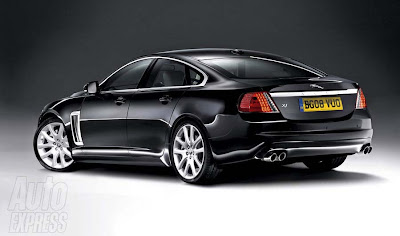
I really think that Auto Express illustration from a while ago looks better than the real thing we’ve seen last week.

What do you think???

Conversation 30 comments

  1. If this were the case people would bitch about it looking too boring (like an Acura…?)

    Nobody is satisfied all the time. I think the new XJ is just fine the way it is. STFU Vince

  2. Yep. It did look better.
    You'd think that Jaguar's team of stylists would be better than a mag's photoshoppers…

  3. Well, it's more handsome, but I think the production model in the end is more elegant and Beautiful. This "XJ" looks more like something XF sized, and is somewhere between an Citroën C5 (not at all a bad looking car), and Audi, and a Volvo. Plus, the giant side vent is kind of tacky. I think they nailed it on the new XJ, we just have to get used to it. Don't be so pessimist, you seem to always rant about "ZOMG THIS CAR IS SO FUCKING UGLY-WHAT IS WRONG WITH THE DESIGNERS, ARE THEY HIGH?!!!!!" and then 6 weeks later. "In person, this car is GORGEOUS". So maybe you should reserve your judgement until you see it in person?

  4. Vince,

    I agree 100%. It keeps the modern feel while also being more faithful to the XJ's historical design. This rear would have sold much better than the current cars.

  5. Eh, the rear in that illustration just looks like a G8. I mean it looks good and all, but I think the rear in the actual version is more svelte.

    I still can't get over that damned blacked out D pillar, however.

  6. Absolutely better. Still a little too much Audi, but nicer detail in the rear. Can't afford one anyway, but if I have to get stuck behind one, I would rather look at this.

  7. Disagree. Had they made the XJ like this you'd be complaining about how generic it was, how it could be an Acura or a BMW and how Jaguar needs to try a lot harder than this if they want to survive.

    Instead they've made a distinctive design with a few risky elements which at least tries to be modern and elegant. Guaranteed it will grow on people, even you Vince. But I guess it's the nature of a critic to never be happy.

  8. Maybe slightly better. I might like the actual car better in black to hide the blacked out rear window pillars.

  9. Looks more like what a Jag should look in this day and age. From behind the actual production car looks like something Geely would do to get up-market.

  10. Vince, I love the rear of this rendering…it definitely would have flowed with the front of the REAL new XJ….but in my opinion is does not appear to be as stately as the new XJ's rear end now has grown on me.

    I also like the vertical vent on this rendering better.

  11. I agree – that rear end needs a horizontal element sooo badly. The illustration wouldve more than done the trick.

    Currently its got an aggressive front end, a passive rear end, and a pseudo retro interior.

  12. This is bang on!!!! this is exactly what it should look like…. this back end combined with the front end of the actual one is spectacular…. What jag has come up with is a pathetic joke!! the front end is beautiful but the ass end is hideous, it does not look luxurious or expensive at all, i hope they go out of business because of that terrible excuse for a design

  13. Y'know, sometimes I think that before automakers turn to their in-house designers, they should also include auto illustrators /photochoppers, etc & have a styling competition and see who has the more eye-catching design. When I first saw this particular illustration of the XJ done by Auto Express, I really thought that a beautiful car & had hoped that this was actually going to be the next XJ. It looks so much better than what Jaguar actually did, especially the rear from the c-pillar and the rear, as a whole. The chrome strip just above the license plates & rear lights really look great. The front also looks better than what Jaguar did, too. So Yes, I am a bit disappointed, especially with all the hype building up to July 9 that this was the best Ian Callum's design team could do.

  14. BLACKLASER…I agreed with you this time. just this time.both have boring tail lights. both the illustration here looks better.

  15. Jaguar is irrelevent anyway…Has been for years. This is much more manly than the goofmobile they will produce…I would rather have a freakin Genesis at the same price.

  16. Car companies should fire their twitty designers and google for photochops…Self-proclaimed designers have NO sense of style or class!

  17. Kiss my ass Mr. 1:16. You clearly have no clue on what it takes and the hurdles that have to be jumped to get a half-decent car out the door.

  18. I don't like this either. It is too bland, but it is more coherent. The production design is bland but also sloppy. Is there a door number three?

  19. this looks like a rover to me.the new jug looks like the lancia thesis from the back…i dont know.
    i xpected sth else

  20. Gee. So much hate here. I'll be glad when Vince's site gets back to discussing cars and not fighting about them.

    I think the Audi Q3 and even the A5 Sportback blows the BMW "crossover" out of the water. Thanks for the pics, Vince.

  21. The problem is, this isn't a design of a $75k car. It's a design of $50k car. It is quite generic looking, and there's nothing striking about it.

    I'm starting to like the blacked out c pillar and the rear.

    The profile is just striking.

Leave a comment

Your email address will not be published. Required fields are marked *