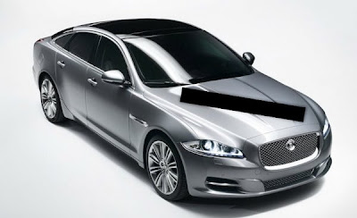
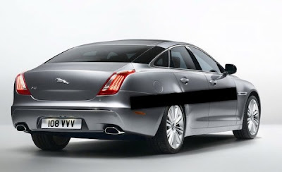
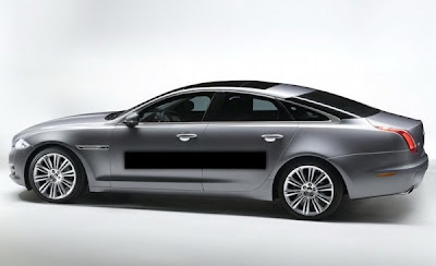
2010 Jaguar XJ
Last Updated:
So that’s it.
The all new Jag.
From these pictures, at least, it looks like a weird cartoon of a Jaguar. Something a kid would draw.
Looks like a bunch of designs put together. Like about 6 designers worked on the car without ever talking to each other…
Or maybe it’s just the pictures.
Who knows…
Meh. I'm not swooning to have one. I understand the former relationship with Ford, but to copy a Lincoln's rear end is beneath Jaguar.
The old (current) XJ still beats this.
"From these pictures, at least, it looks like a weird cartoon of a Jaguar. Something a kid would draw.
Looks like a bunch of designs put together. Like about 6 designers worked on the car without ever talking to each other…"
Whatever Vince…this coming from a person a person who fancies Chinese designs. Each to his own. I think the design is very cohesive and much more true to the concept of XF presented years ago.
I cant believe it! Another car maker ALMOST does it perfectly, and then they go and change what works.
The XF is a beautiful car, accept for the silly headlights. BUt the absolute best bart of that car is the rear – so Asont Martin like.
Now the XJ comes along, a reinterpretation of the XF design on a larger platform, and they FIXED the front end and lights to make them exactly as they should be.
But THEN – what THE?!?! They THREW OUT the AWESOME BEHIND of the XF and opted for a souless, featureless, nothingless rear of a lincoln MKS? COME ON!
They made a beautiful, aggressive looking beast of a beauty, and then just gave up on that theme when they got to the back. Nothing – theres simply nothing there! Are you taking cues from Chrysler?!
It'll grow on us, trust me IT'LL GROW ON US.
The side profile so so sleek, and the front end is gorgeous, the rear is elegant (reminds me of the Citroën C6 in a way, and also of Bentleys) , the blacked out c-pillars are a bit odd though.
What's with the black bars in random places.
This is the BIG Jaguar, so it's supposed to be more mature and elegant looking, the people who buy this have a lot of money so they want a top-notch product that is nothing but class. Which this is
The front half is nice.
The rear end…whoa.
I can understand where the front is coming from (XF) but the rear is just hideous. The design of this car is absolutely no cohesive at all. Like Vince said it, there were at least 6 designers on this car who weren't communicating it until the final draft. Front yes, rear no! They could have fix this car by using the front of this one and rear of XF. But just don't mixed them up! A failure.
Well, I'm a little bit sad about the design of the new XJ. I always loved the XJ design, but I also love the new XF. It's sporty and modern, but still has class. And now I see the new XJ. The front is absolutely beautiful, the side lokks nicely flat. But then…the ugly back. The backside ruins the car with it's Lincoln-Rolls Royce-Bentley design mix…Jaguar, come on, change that back fast!
You blacked out the watermarks? Classy… really classy…
Definitely not a fan. The fact that Jaguar took SUCH a long time to come up with a design consisting of an XF front and hideous Lincoln rear is very upsetting. All I can say is, RIP (real) Jaguar XJ: 1968-2009.
Oh, and the profile looks awfully familiar…hmm…
http://www.easypedia.gr/el/images/shared/7/72/Citroen-c6-05big.jpg
the C pillar area is overly fussy with the black tint. The rear belongs to an experimental design of portfolio a Citroen sedan, not Jaguar.
Though the new XF looks nice, I think Jaguar has completely lost its design language. Jaguar is going about it the wrong way.
If I were running Jaguar, I would focus more on interior design opulence, a la Rolls Royce style. After all, drivers spend their time inside the car, not outside.
Back in the 70s and 80s, Jaguar advantages over other luxury car makers in terms of interior design and materials. But the Germans and Japanese caught up quickly.
Then in in mid-late 90s, Jaguar took a turn for the worse, and starting sharing part bins with Ford, at the time other luxury makers (except Mercedes) were busy anteing up one another.
By 2000, the damage had been done, and although Jaguar's interior became deluxe again, it was no longer the benchmark.
Unfortunately, the streak continues with the new XF. Despite its splashy exterior (though not worth $60k), the interior design aesthetics is outdone by BMW, and maybe Audi.
I hope this new XJ has signifcantly better interior than XF. Otherwise Jaguar is done for for awhile.
Front is cool, but the tail lights are horrible !
And why the C-pilar have to be black ?
Watermarks were already blocked out when I got the pics…
From the front through the rear doors, it looks gorgeous. But then they ruin the rest with the stupid blacked-out C-pillar and very Asian rump.
while i agree that the blacked out c-pillar is a bit odd, it makes sense when you look at the rear view of the car – it is clearly meant to trick the eye into thinking the car is wider than it really is, especially since the tallish taillights and high boot make the rear window appear small.
the front is amazing, and the side profile has strong lines and presence, and honestly, the rear is growing on me… you can see (at least by looking at the left taillight from this angle) that there is a hint of the previous generation signature taillamp, which is a cool design feature
idk it does really look good to me, and will surely be a knockout in the flesh, much like the current XF
I saw an XF in person just the other day, for the first time ever. What a difference that makes: on paper, I didn't like the car. In person, it is stunning.
I like this car; I think I can see where they were going. Headlights work. I think the taillights work too; a little Bentley/Rolls-ish…
Complaint? The tinted C-pillar. See, the idea is to hide the pillars with the tinted windows. But, it fails simply because of the chrome frame around the windows. Take that chrome out and it'll mesh perfectly.
Wow, I think it is amazing looking….and looks very distinctively rich…a la Bentley and Rolls. Nice job.
I quite like it. The blacked out C piller is a little cheap but props for trying something new. I am also quite fond of tbe rear end, take that haters.
The c-pillar is just gimmicky. If they were going for a classy look, they just killed it right there. Because personally, I thinbk this is a pretty hot car, but wtf jag? That c-pillar just looks awkward.
I bet a bunch of aftermarket guys are going to be spraypainting the c-pillars back to their intended color.
Either that, or people are just going to buy this car in black.
Hmmm. What a shame. Jaguar used to be so elegant and beautiful…
I could see many of these being taken to a body shop to paint the C-pillars body-color.
>>>This car has panache, yeah there are some details that many may not like, but I can respect Jaguar for taking design in a radical direction from its traditional styling. I like many on this blog don't exactly car for the ass of this car. They could have put a chrome strip with Jaguar embossed on it like the XF to break it though. However I think this will grow on many.
The blackened C-pillars I see that becoming an option, more than likely Jaguar will gauge reaction, and see that many are opposed to it and decide to go with the body color that would really fix this car up. But as it stands as we see it….this car would be phenomenal in black only.
I do see this as being a great segment entry that will challenges the S-Class, 7-series, and Quattroporte. As for the A8 you never know what surprises Audi will bring. However, good effort Jaguar, something fresh and modern its a risk. They will lose traditional XJ buyers, but will gain a whole new audience with this one.
I give this a 9 out of 10!<<<
What the dude said above…They ruined the back end…Otherwise…..
The backend was designed by the EU Safety Maggots. Don't want to hurt a smelly ol pedestrian when you back into them!
Looks like a chinese luxury car.
I want to see this car in BLACK. That way, the rear pillar becomes less of an issue…
Either way, I think this is a gorgeous car. The front is especially nice!
Aside from the blacked out C pillar, I really like it. I am sure it will be even more stunning in real life.
People should withhold judgement until then.
Vince, who did you steal these pictures from and remove the watermark? You know that someone is probably going to ask you to take them down, right?
Don't like those tailights on the Lincoln MKS, and think they're boring & generic here too. Otherwise it looks as good or better than any A8 or Lexus top-line sedan… but I guess that's hardly a compliment. Cadillac has nothing to worry about.
Voila..this is just something out of this world a perfect beauty from front and rear end.
I dont know why so many people complaninig about it, they probably dont have the money to buy it…..well neither do I.
This care is going to look stunning in person when u see it.
Cheers
I actually like the design of the Lincoln MKS, but that XJ mess with the blacked out pillars is not cohesive. Good in theory, not in practice. The long sloping pillar needs to be painted metal, I'm sorry. Love the rest of the car, love it. I have NO complaints about the XF design, especially the XFR.
What kind of world is it where the only automakers with a comprehensive sense of style are Audi and Hyundai, and even Audi is questionable?
Beautiful car. But I think the blacked out c pillars look cheesey. They remind me of the blacked out rear quarter windows that everyone complains about. The first thing I'd do after I bought one is bring it to my local body-shop and have them paint over them with body colord paint. Not that I'll ever be able to afford it. I can't wait to see the inside.
I suspect that the black on the C-pillars is not paint but has something to do with electronics. Notice that there's no conventional antenna on the roof? It's probably a glass or carbon panel concealing electronic equipment…possibly even for a vehicle detection system?
As far as the tail lamps, I hated the photos of the Lincoln MKS rear but when I saw it on the road it looked great. Photos these days do NOT flatter cars. You have to see them in person to appreciate the coutours and dimensions.
What a tragedy. IP is kinda neat though.. Exterior is not even worthy of digging up juicy superlatives.. I'm just kinda bummed…
What a purrrrrty car. Overall I think it is very attractive. Agree with many that the back is a let down, although the taillights are very cool in close up photos.
Interior is also very attractive, I would not of put all those round vents everywhere, that really cheapens the whole look. Jags should not be about the trend of the moment.
It might as well be a Kia. The interior is 8th grade.
Front 3/4 view is good, but I have to agree that the rear is a bizarre mess. The tail lights look like a Lincoln and what is up with the ugly crease in the trunk lid. Reminds me of something Buick did in the 80s-90s
donno
i see the new generation crown majesta from behind
that's the link