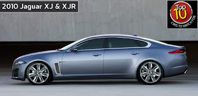
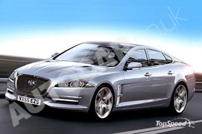
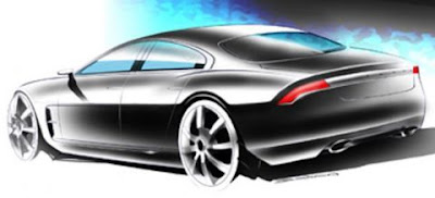
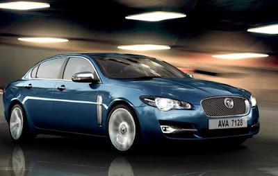
More 2010 Jaguar XJ Illustrations
Last Updated:


More of what people were guessing.

Looks like most guessed the front end of the car, while the rear was a total surprise.
And nobody even thought of the horrible rear black panels around the window…

Conversation 8 comments

  1. Wow, Vince. You must be REALLY depressed about the new Jag.
    Most of those illustrations still look disfigured… or bland… or disfigured and bland.
    Except the last sketch with the maserati boomerang taillights – that looks pretty damn cool.

  2. Hi Vince,

    A friend of mine, with whom you work, told me about your blog…Love it..And, my daughter does too! You've got some fun characters posting comments ;-}

    As to the Jag – blech! I miss the old lines, the curves…Jag used to have style and stand apart, now it looks like everything else..only worse!

    BTW, if you hear anything about the Scirocco coming to the US you will let us know right??? As a recovering 'roc owner from 1989 I'm just itching to test the new one.

  3. Thanks for your comment.
    But the Scirocco won't be coming over here…

    WV USA is just too stupid.

  4. The third one is ace. That's exactly what it should have been like.

    And I think Vince is right in decrying Jaguar's foul-up. The XJ has stuck with more or less the same styling lines for, like, 40 years. When they finally decided to go ahead and make it modern (something I had been hoping for for quite a while), they HAD to get it just right. But they didn't. It's a failure that deserves criticism and comment.

Leave a comment

Your email address will not be published. Required fields are marked *