2010 Volvo C70

Last Updated:


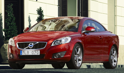
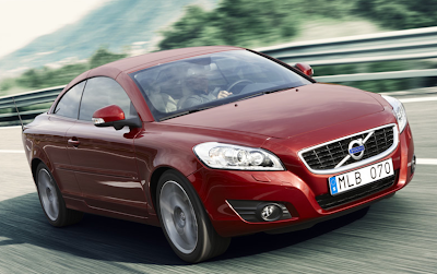
Mostly a new front end.
That matches the new “more melted” Volvo look we can see in the XC60 and the next S60.
I’m not sure if this is an improvement. The C70 has always been a really nice looking car and didn’t really need a new front end. But it could have use the great looking XC60 dashboard.

I wonder if the C30, S40 and V50 will adopt the new front next year…

Conversation 16 comments

  1. Somehow, the placement of the grille and the headlights looks very Chevy Malibu-ish, albeit a bit sleeker.

  2. the swedish surely likes to make non-sporty FWD cars and charge a premium for it, you can spend half as much and get a malibu/camry/accord, it's just as dull to drive, but at least you get some extra horsepower from a v6

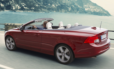
  3. The styling of the front end and rear end is very unbalanced. If they were going to restyle the front end, they should have put the same amount of styles at the rear end as well.

  4. This is what I call a perfect facelift. The old face looked really good, but the new one looks even better and fits perfectly with the rest of the design. I really love it. And it looks much more modern and separates the more expensive C70 from the rest of the crowd around C30, S40 and V50.

  5. I think it looks great. I liked the way it looked before. What they needed to do is fix what's under the hood. Needs a more powerful engine (at least as an option) to compete with other cars like it.

  6. They also need a new interior- the floating stack looks nice, but they've been using that for the past decade already.

  7. I'm not sure what I think about this. I'll have to wait to see it in person. My first impression is that this is not as good looking as the current front end design.

  8. A friend of mine has the current body style & he has had quite a few electrical problems with his. For the money there are several other cars I would choose over this.

Leave a comment

Your email address will not be published. Required fields are marked *