All new 2010 Chevrolet Agile
Last Updated:
This was supposed to be mainly for foreign markets, but I also hear it could come over here as the next Aveo.
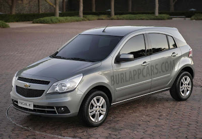
It looks OK, but really, almost nothing like the sketch GM released a few weeks ago. What a shame.
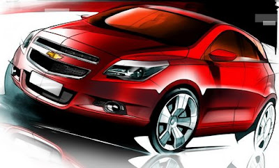
Not sure what the deal is here…
Maybe the sketch shows a US version, or something. The front is not even the same.
Plus the black plastic on the side behind the rear window looks really bad and cheap…
We’ll see.
More pictures soon.
Did they intend to recreate the previous model of the Toyota Matrix?
I disagree Vince. The sketch look just as stupid. What a terrible car. A total WTF moment. It looks like a crappier version of the lest gen Astra.
BOOOOOOOOOOOOOOO!!!!!!!!!!!!
same as sketch, what are you smoking?
Why do Chevy (and others) think these black spacers on the c pillars look acceptable? I understand they are there to keep costs low but, these manufacturers spend all this money on what's (for the most part) an excellent design and then just follow it up with the crappy, cheap looking black spacers. WHO THE HECK APPROVES THIS CRAP AND SAYS YEAH…THAT LOOKS GREAT!!!
Vince, did you expect the actual car to look like a cartoon with red-tinted windows and dubs?
Do they seriously plan to go head-to-head against the Fiesta and Fit with THIS? Back to bankruptcy court…
how hard is it to put in a window? Aren't they aware of the Chrysler Sebring complaints?
this thing actually looks more like the Cruze in terms of size and design.
The current now defunct Pontiac vibe is way better than this monstrosity.
Actually, this looks very close to the sketch except for the front bumper, mirrors, and the oversized wheels. I'm also not sure that is actually black plastic on the C-pillar. It could be, but to me it looks like bad lighting and the odd C-pillar crease are making the sheetmetal look darker.
Rio5?
I agree. It looks exactly like the sketch except for the sheetmetal.
The answer to the question:
What would a car look like if the Dodge Caliber and Pontiac Vibe had sex. This car is ugly and dated.
If this was a Korean model, it wouldn't look like the sketch. How can you say it looks like the sketch when the bumper is watered down. The over all desing looks like a Rio 5. The antena is in the same location as the Ford Focus. Like Vince thinks the Sorento want get noticed, will this get noticed. What do the tailights look like? Will it look like a Toyota, Ford, BMW, Infinit, the Dymanite the one the Malibu's tail lights take after? Will it be horzanto or verticle like Caddy's or the Chyrsler 300? Or will the be horazantal like the Kia Sorento, 2011 Jeep Grandcherokee, Lexus RX, Toyota Highlander, Audi Q7, Acura Mdx, hONDA civic and many others like the Corolla, Camry. The Pontiac G8's greenhouse came from the 2006 Nissan Altima's.
Looks like a Chevy "saturn vue". no surprise here.
this car is pathetic. it's based on the 1993 opel corsa platform and engines (no joke). It has a truck front, that belongs to a much bigger car, and the side is just… look at the plastic bit at the C column. there's no cohesion. they probably had 15 different people designing each part and then they just glued it alltogether. what are they thinking? it looks completely different from the sketch, even though it has the same design principles. the sketch gives you a smaller car, that is closer to the ground, and its front end actually belongs to that car. i mean, look at the size of those headlights and that grill!!
What a twisted sick and infantile mind that came up with this…Like an American TV watcher.
Probobaly the same cheap crappy plastic interior as CR-V, Corolla, Caliber(2008) and Civic.
Absolute rubbish!
The sketch is of the "Tigra" (Corsa Coupè), not the Agile
I'm pretty sure the new Opel "Agila" won't look like the Chevrolet "Agile"