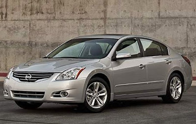
2010 Nissan Altima
Last Updated:

The usual (and not necessary) mid-cycle refresh.
A new bumper, with a new grille. And slightly revised headlights.
Shuffle the options a bit, colors too. Add a few things like bluetooth and here you go.

Last Updated:

The usual (and not necessary) mid-cycle refresh.
A new bumper, with a new grille. And slightly revised headlights.
Shuffle the options a bit, colors too. Add a few things like bluetooth and here you go.
I'd still rather have an Accord.
I think this refresh has made the already aged Altima look even worse.
Not a significant change, but it looks nice enough for a midlife tweak to a mainstream car. I'd be happy to own one.
I disagree… I think this looks better… something about the previous look that makes it look bloated..
I'd take this over Camcord…
I'd take Malibu or Fusion overall in this segment.
Not a big fan at ALL.
I'd rather have an Accord, Sonata, or Fusion over the Altima any day of the week.
The interior is crap, proven by the few I have had as rentals and Vince's test coupe.
As far as refreshes go, this is pretty unremarkable. But it appears the chromey taillight clusters have finally gone the way of the Altezza! 🙂
I've honestly hated every single Altima other than the first generation. The third generation is the worst.
what a gorgeous piece of kit. a real boulevard car, just enough bling.
The 2011 Sonata looks better. While people complain about the Sonata's headlights looking like the Solara's no one said this looks like the Prius's. Why? Because Nissan isn't Hyundai. It's alright for Nissan to copy but ohhhh no not nothing from Korea.
profile is odd looking because of its tailights. The grille makes it look cheap.
"C. Werg said…
what a gorgeous piece of kit. a real boulevard car, just enough bling.
September 25, 2009 6:31 PM"
Fanboys make no excuses, no holds barred.
A cheap midsize a boulevard car??? HA!
What happens when you don't opt for the fog lights???
the fog lights fit in the fog light hole, dahhhhhh. this is a boulevard car, what a gem, same guy squared.