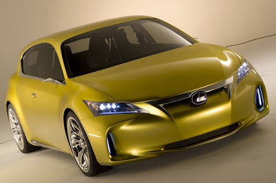
Lexus LF-Ch Concept
Last Updated:

So far it does look quite weird to me.
Kind of overdone. The opposite of an Audi.
And that is supposed to be Lexus’s best chance in Europe.
We’ll see….

Last Updated:

So far it does look quite weird to me.
Kind of overdone. The opposite of an Audi.
And that is supposed to be Lexus’s best chance in Europe.
We’ll see….
ok enough is enough. are they all on drugs over there? who designs this CRAP!!?!?
My experience in Europe tells me this look wont fly, particularly not with the luxury car crowd that Lexus aims at. They can get away with most of it but the nose of this things needs to be changed so it looks like an adult designed it and not some manga-boi.
Look like the rumor is ture. This concept is really close to the production one.
We might have to see several angles of the car first.
It is overdone, but the basic design is there. The production version will likely have the traditional Lexus grille. The headlights probably have the production shape, but will use conventional lighting, not LEDs. The biggest change for production will be to the lower fascia below the headlights. It will probably be more conventional and squared-off while retaining the vertical foglights. The lower air intake will also be larger.
However, there will be a new A3 and 1-Series introduced about the time this hits the market. I'm not sure this will compete as well with those next-gen models.
The headlights in the first teaser are better.
The sheetmetal looks conventional, but then the plastic soft bits are very ricer and aftermarket looking. The front bumper looks like it's tacked-onto the wrong car.
It looks like Lexus it taking the surfacing language they currently have and just amplifying it on this car. It's nothing new at all. A GS 350 front-end dialed-up, some Kia Koupe foglamp holder holes, some ghetto wheels and paint!
It couldn't look more Japanese if it was filled with raw fish. That's so wrong for Europe – they still don't understand why Lexus never took off there, do they.
hmmm….I think it's not too bad….
Well…it does not look like the Honda Crosstour.
looks like a Kia…
Thats awesome for a Lexus.
Even if they do tone it down a bit it would still be pretty good.
I think it looks pretty good. Very futuristic looking. And yes a little weird too…but good.
And yeah, it does have a bit of a Kia look to it.
Who cares.
By the time this makes it to market it will be boring as any other Toyota/Lexus.
Lexus = Japanese Buick with a dying owner base.
The bumber came from the Kia Kee concept. See those holes. the A pillars reminds me of the Acrua MDX.
Looks like a lemon that just sucked a lemon –yuck!!!
The only thing I like is the grille. The bumpers came from the Kia Kee.
A disappointingly soft and gimpish looking design. This neither excites nor inspires. Neither Audi, BMW or Mercedes should lose any sleep over this schlump of an eyesore.
Actually reminds me of a Civic… That front end and hood is could be the next Civic
But i would still own one over the german brands.
I think this concept looks really good. Guess the real thing is a bit sleaker than this one. We will see…
The LED headlight will make it into production, no doubt.
Go ahead Lexus!
The C pillar needs to be refined, along with the complete front fascia. It's a better exercise in the L-finesse design language than the HS 250.