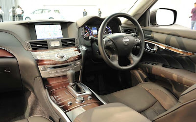
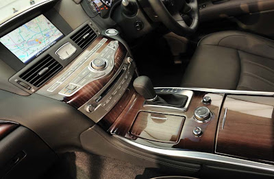
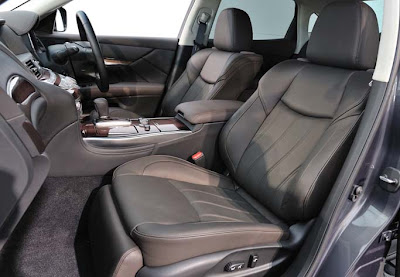
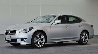
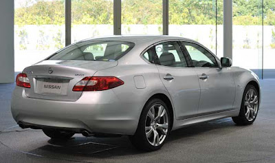
More pictures of the new Nissan Fuga/Infiniti M37
Last Updated:


It makes the current one look pretty dated.
The interior does look a bit melted, or weird. But also kind of impressive and original. Depends how you see it.
So far, I kind of like it.
Except for the ultra cheezy airbrushed looking wood on the console. With darker tones on the side.
I haven’t seen anything that vulgar in years.

We’ll see if that makes it into the US version or not….

Conversation 32 comments

  1. I don't know why, but every time I look at this I keep thinking "RWD Maxima." It has the same general shape and fell to it, especially with most of that front end. It still looks good, but it's obvious that these designers were struggling with making a new shape for a full sized car.

  2. I am not loving this design. Too many styling cues without one strong look. The grill looks like it was taken off the Maxima, the roofline has a strong resemblence to the Buick Lacrosse and the seats remind me of diagonal house siding from the '80's. It's not a bad looking car but does not have a look of it's own.

  3. I actually hate this. The design overall looks terrible, only the side profile is somewhat appealing.

    It doesn't make a difference though because I will NEVER buy another Infiniti.

    I bought my wife 2005 FX35 because she HAD to have it. Four years and 60,000 miles later the interior is completely falling apart. The leather looks terrible, the plastics look awful and trim pieces have broken with NORMAL, careful use. I take great care of my vehicles and I condition the leather every other month with Lexol, it didn't make a difference.

    What can you do? As the saying goes: "Happy wife, happy life".

    I'll never buy another.

  4. I like this car. It looks pretty muscular looking. I myself like the wood too but I still HATE those cheap looking centerstack vents. In addition I think the centerstack itself is a little too wide. I wonder if it would be a more comfortable car if it had some more lateral leg room.

  5. This looks almost same as current model so don't know why this one makes the current one look dated?

    Remember it will be 2 more years… Bound to look dated by then. Also looks like a Maxima + Buick mix. Nothing new.

  6. The G35 – G37 are such good looking cars with appealing design details. This M37 just doesn't cut it…Japanese designers should put away their heat guns and stop melting their designs. Leave that up to Toyota.

  7. wtf? are you on drugs?

    this looks like a kia from 10 years ago. fugly.

    nothing about the design makes it look "premium".

  8. Thit entire vehicle is completely vulgar.

    The interior is a disgusting combination of textures and shapes, luxury buyers will NOT take this seriously.

  9. You know what, I can't blame Subaru for being pissed at Infinti for copying their Lagacy desing and calling it the Infinti M. I see what they took the Infinti G sedan's headlights and placed it oon their Legacy. Good for them. Lol. Unless it's only what's the word subjective? It's my subjective that the Kia Amanti looks like a Benz? Lol.

  10. It is Infiniti's new corporate design theme called "Boulbous Psychosis". It is cool and trendy…Seriously!…It is!…I swear!

  11. Dash is disproportionate thanks to camera positioning. Everything looks good, but the rear, which looks uninspiring. And I agree that unless it carries fancy wheels, someone will say, I have seen this design before.

  12. oustanding! Rolls Royce, Look Out! Nissan Rocks. This is a stunning gem of masterful design. In Studio research centres ( in U.S) featuring this car ( no badge) and various toyota and lexus/ honda/acura models, this car was rated 10x more appealing than all others overall . Now remember, all of these people, including me, were either toyota/lexus owners or Honda/acura owners. Go Figure. It's no wonder why this car is here looking this stately.

  13. Now to reply to give them what they want said…

    Dude all it is is the Buick Lacross with a Infinti badge on it.

    Infinti's looked better in the past in my own "subjective world."

  14. First three things I saw of the car was a muscled G37, tail lights of a Jag and the grill of a Nissan Maxima. I've given up finding a $50K car with its own identity that's not German.

  15. This is very generic. It could be a Maxima or it could be an Altima. Or it could be something Korean. Gasp!

  16. Just like many others have said already, I, too, find this vehicle vulgar in every single aspect.

    The interior is overdone and that rear end is terrible.

    They can keep it.

    "Give them what they want said…
    oustanding! Rolls Royce, Look Out! Nissan Rocks. This is a stunning gem of masterful design. In Studio research centres ( in U.S) featuring this car ( no badge) and various toyota and lexus/ honda/acura models, this car was rated 10x more appealing than all others overall . Now remember, all of these people, including me, were either toyota/lexus owners or Honda/acura owners. Go Figure. It's no wonder why this car is here looking this stately.

    October 10, 2009 7:55 AM"

    This is the "What a beautiful piece of kit" guy who just mentions things he hears from his friends that isn't true.

    A design studio. Right. 10x better? Right.

    Get real, you weren't invited to anything, stop making things up.

  17. That interior is a disaster.

    Looks like a designer took some PlayDoh and squeezed it and then told someone to make a dash from that shape.

    It is ugly and childish. Vulgar is a very good description.

  18. I was invited to Japan to see this being made and all the reviewers said this was stylish and then we all went to Tahiti and got laid.

  19. I'll take a E550 Sport, thanks.

    "Anonymous said…
    I was invited to Japan to see this being made and all the reviewers said this was stylish and then we all went to Tahiti and got laid.

    October 12, 2009 8:02 PM"

    Hahahahah I was on that trip too!!!!

  20. "Give them what they want said…
    oustanding! Rolls Royce, Look Out! Nissan Rocks. This is a stunning gem of masterful design. In Studio research centres ( in U.S) featuring this car ( no badge) and various toyota and lexus/ honda/acura models, this car was rated 10x more appealing than all others overall . Now remember, all of these people, including me, were either toyota/lexus owners or Honda/acura owners. Go Figure. It's no wonder why this car is here looking this stately.

    October 10, 2009 7:55 AM"

    This guy is a complete tool.

  21. I liked the Infinity's look better a few years ago. When the French took over they definitely improved on the Japan-copy's-America styling. But now it's getting too French. Too many french curves. Too rich, too overstuffed, to hedonistic, too busy. In a sickining sort of way. They need to re-visit the Citroen School of Minimalist Design and clean it up a bit. Copy Volvo, not Mercedes. Get back to your roots, French Nissan!

  22. "Not for me said…
    I actually hate this. The design overall looks terrible, only the side profile is somewhat appealing.

    It doesn't make a difference though because I will NEVER buy another Infiniti.

    I bought my wife 2005 FX35 because she HAD to have it. Four years and 60,000 miles later the interior is completely falling apart. The leather looks terrible, the plastics look awful and trim pieces have broken with NORMAL, careful use. I take great care of my vehicles and I condition the leather every other month with Lexol, it didn't make a difference.

    What can you do? As the saying goes: "Happy wife, happy life".

    I'll never buy another.

    October 9, 2009 6:19 AM"

    Wow, an experience like mine!!!!

    I had a 2004 G35 sedan and the interior was also falling apart after five years.

    I traded in a '98 C43 with over 120,000 miles on it and it looked BRAND NEW both inside and out.

    I'd never buy another Infiniti, the quality just isn't there.

  23. The current M35 and M45 are pretty lame as is, I don't think they are competitive and their sales prove that.

    I doubt this is going to be a game changer. If I had to buy a midsized luxury vehicle, my money would go to Mercedes.

  24. All the anonymous bashers may not see it or want to cop to it, but there seems to be a slight bit of Quattroporte in its shape. It's growing on me a little, but one thing's for sure, this car has broken from its Cedric/Gloria family tree.

Leave a comment

Your email address will not be published. Required fields are marked *