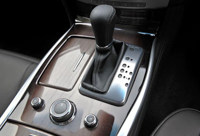
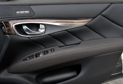
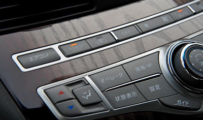
2011 Infiniti M/Nissan Fuga interior
Last Updated:


I noticed this before, but what is the reason for the fake and horrible looking wood color????

The wood parts are darker on the edges, which makes it looked airbrushed. Giving the whole interior a vulgar 1970’s feel to it.
Why???

I hope this is only for the Japanese market Nissan version of the car, and that it won’t end up in our Infiniti version.

This is one of the worst thing I’ve seen inside a car in years.

Conversation 17 comments

  1. Loving this interior. Yes, the wood does look odd, that is the point of your distain, but the over all design is gorgeous.

  2. i like it. i have a mid '50s Grundig Majestic, a console radio/record player, with an ebony-to-teak fade like that and it's gorgeous. it's different. i'd bet there will be specific wood/alloy options, like other high-end cars. the Q45t i've owned for the past several years is the best car i've ever owned, period, in a long line of MBs, Saabs, Lincolns, Cadillacs, Toyotas, etc. i'll probably keep the Q for the rest of my life.

  3. Vince, I completely agree. That wood is awful and the dark corners make it look even worse.

    Also, EVERYTHING about this vehicle is overwrought. Look at that door panel for God's sake!!! There are so many twists and turns.

    No serious luxury buyer will consider this over a E Class or a 5 Series. I certainly wouldn't.

  4. I think the interior looks great. Very stylish. Yes, the wood could be better, but otherwise it's an improvement over the current M.

  5. It looks sun bleached. Also, the shifter area and controls don't look very good. I'd rather have a more stylish Audi A6 or more distinctive CTS. Or even downsize to the G, which is proportioned much better. The design of this M doesn't appear to have progressed at all.

  6. I've seen that exact same sort of 'wood' being used for new kitchen cupboards. Apparently it's the 'latest look' embraced by many interior designers. I don't like it in kitchens anymore than I like it in that car. It looks – as you say – very 70's. It might not be fake wood though.

  7. It looks like that cheap wood used on gaudy dining rooms from the '70's, the seats should have plastic slipcovers and the dash should be crushed velvet to complete the look.

  8. Infiniti has forgotten that less-is-more. It looks like something that a bleach blonde realtor with long red fingernails would drive.

  9. This looks awful, plain and simple. From the complicated looks to the awful 60's and 70's wood trim.

    Infiniti is simply trying TOO hard.

  10. "You're on crack. This is one of the better interiors I've seen in a while!"

    Hey, different strokes for different folks. I don't hate it, and it's great that Nissan continues to try new things. But I've never liked Nissan's japanese zen garden aesthetic. It always looks better in pictures. But in reality it seems superfluous and contrived. Especially with Nissans less than top-shelf bits and pieces.

Leave a comment

Your email address will not be published. Required fields are marked *