2011 Lincoln MKX and Ford Edge Interiors
Last Updated:
Most of you were right about my post yesterday.
I was wrong by thinking it was the new Focus interior. I forgot the revised Edge was being introduced in a few days.
And what an improvement these new interiors are.
I always liked the Edge and its Lincoln cousin, but the the Ford’s interior was a bit of a mess. And most everything you touch felt pretty cheap.
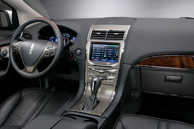
These interiors are HUGE improvements. I find it amusing that Ford is still using the power mirror switch that I had on my 98 Contour on a 2011 Lincoln!
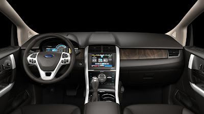
I am not 100% convinced on the Edge interior, though. The Edge has been positioned as "sporty" especially with the Sport Package with 22" wheels, yet this interior has wood trim.
at first glance, for some reason, the Ford looks more 'premium' to me than the LIncoln's. Maybe it's the center stack and the way the wood swooshes up on the side of the MKX. the Edge's shapes seem more modern to me too.
they're both quite stylish though. Ford is on a roll!
What the hell has happened to domestic automakers? They actually CAN build interiors after all! I was in a CTS earlier this week and was shocked at how solid and beautifully designed it is. I also sat in a Mustang and wasn't expecting much, since its interior has always been pretty bad. The new one is nicer than anything Nissan is putting out. Same with the Taurus… very nice.
So what took so freakin long? Did it take almost going bankrupt to get them into survival mode? Now if we could just all agree that fake woodgrain is not acceptable in any car, all would be perfect.
My parents have the new lincoln, the interior is very truck like with very hard plastics. A real dissappointment, although it does drive nicely.
Ahhhh Vince. If you need someone to work w you let me know. Both are a HUGE improvement. The feeling of both interiors were really cheap and the exteriors were not much better, THOUGH the revised exterior of the edge was a vast improvement. I know it was minor (Head and Tail lights) but were huge. I don't like Lincolns new design theme with the split grille… Makes no sense at all. Ford on the other hand has been stepping up the design theme for they're own vehicles (The blue oval vehicles). I hope they have better gas mileage though because they were both pretty bad
I also think the Ford's interior looks more premium than the Lincoln's….after many looks.
I like this interior, except I think it may provide so much information it could be distracting.
I did notice that there are buttons instead of dials for volume and tuning. Nothing is easier to use or more intuitive than a dial – no reason to use anything else.
Also, I have a beef with speedometers with exaggerated readngs – who's driving 140 mph in this car? Better to have bigger readings on the speedometer and spread it out – top it out at 85 mph (like the '77 Buick station wagon I learned to drive on), or maybe 100 mph if you want to seem more "sporty."
There really isn't much difference in the interior to make me want to fork over 10 grand or more for the Lincoln. Maybe Lincoln uses real wood and better grade leather? Lincoln still needs to loose the "Old Man" image that is associated with the car. Cadillac has done a great job with this.