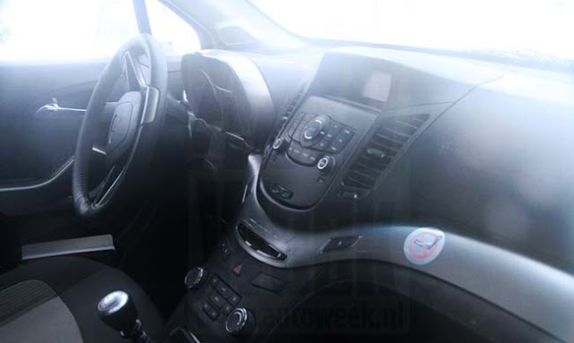
Chevrolet Orlando interior
Last Updated:
Looks pretty nice. In line with recent GM interior designs.
What a difference from just a few years ago…
We’ll see the Orlando here sometime next year as a “more boring” replacement to the HHR.
Last Updated:
This is very nice change indeed, GM finally might be getting the idea that we sit and stare at our interiors hours everyday, if i dont like an interior i will NOT buy the car, but i do wonder why they think this interior needs 1 whole square foot for the radio controls ? they coulda made the lcd screen alot bigger and the controls alot smaller. and you are right Vince the orlando doesnt have half the character as the HHR does !
The orlando may have less character than the HHR, but a lot more space and it will be more usefull. And that's why this type of vehicle exists.
alot more space And that's why this type of vehicle exists.
January 26, 2010 8:48 PM
see equinox and traverse
Not up to typical GM clean design standards. Looks a little like a Honda (ie; cheap)