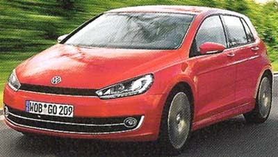
2013 VW Golf illustration
Last Updated:
Let’s hope the 7th generation of the Golf does NOT look like that.
The current one, as well as the previous model, looks much better than this soft and diluted version of the design.
Last Updated:
Let’s hope the 7th generation of the Golf does NOT look like that.
Poor thing , it looks soooo sad 🙁
Rip-off VW Sirocco…
Been getting squintier and squintier since the MkII. Personally I think the Gen I, II and III and the current generation VI got the proportions right. MkIV, Mk V and the one pictured don't look so hot. And can we please call it quits with the billions of LED eyelids? It's a stupid looking fad.
I don't like the look of the horizontal grille without the VW logo in the center of it. The current Scirocco has moved it up to the hood like this chop of the next Golf, and I don't like it here either. Leave it in the grille, it's iconic by now and stands out so much better against the black grille opening.
It doesn't matter what the outside looks like, it will still have a 20-year old chassis underneath all the new make-up like most "new" VWs