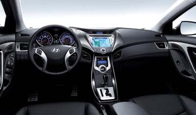
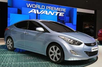
2011 Hyundai Avante/Elantra interior
Last Updated:


It does seem a bit overdone, doesn’t it…

Might even look worse with a light colored interior.
We’ll see…

Conversation 21 comments

  1. I agree.
    Too stylized/dramatic in both interior and exterior. Some unfortunate design decisions that will make it more challenging to sell.

    Is it a hatchback? How big is that trunk opening?

    The interior looks nice, and I commend them for the huge nav screen for a lower end car, which is in the proper position – high and center, so the front seat passenger can view and adjust it as easily as the driver.

    The IP looks a bit odd – is the tach bigger than the speedometer? So many dashes for the speedometer – does it go to 140 mph, or something ridiculous like that?

    Also, I think these notched gearshifts, a la old school Mercedes, is kind of silly – these are practical cars, and it's easier to shift and auto tranny that goes straight forward and straight back – see, e.g., the current Honda Civic, with the gearshift release button you press w/ your fingers – one of the best features of that car (along w/ the speedo/fuel guage/engine temp all at one level).

  2. I think looks great for a $14K car. Also interior looks high quality. This is not just for US market and for Europe/Japan this design definitely doesn't look overdone.

    You rather prefer the Corolla design?

  3. The interior looks like a costume from a Star Wars movie. I would imagine that young people would like it. It's a little to trendy for me, but I appreciate this much detail in this class of car.

  4. Okay.

    To reiterate what I posted over at another car blog, there's a little too much "Alien v. Predator" for my tastes in the center stack. The quality is probably quite good, though.

  5. The exterior of this car looks AWESOME!!! I think a lot better than the Cruze and upcoming Focus. As well as any other small car around in the USA. I do like the interior also, however, I DON'T like the wide siler trim thingamabobs on either side of the radio or nav system. To me, it looks a bit cheesey. I wish they made them much thinner, or put air vents in them or something. I would'nt, not buy the car over them however, but I would always wish they were'nt there.

    This will have a 1.6l D.I. 4 cyl with a 6 speed automatic and manual transmission with a turbo version available for the USA.

    I wonder if there will be a "Touring" version.

    No! I'm not a Hyundai salesman…..not that there's anything wrong with that.

  6. It's not any worse than the civic interior/exterior and that was very furturistic when it came out in 2006 and those have sold just fine.

    This car will do well against toyota and honda.

  7. I think in this category of cars you can afford to be a little overstyled and I think Hyundai did a fine job without going overboard. Think about the alternatives….the Corolla is incredibly boring, the Mazda has that perpetual grin that spooks everyone which leaves the Civic, which is a very good looking car. Unfortunately, with Honda's current track record, they will probably screw it up with the next generation.

  8. I say its by far the best looking car in its class. Anyone who thinks the Cruze can compete with this is an idiot. The new Focus on the other hand will be a great competitor.

  9. The silver plated plastic trims, that look like wings on both side on the navigation, drive me crazy!!!

  10. at least now i know where a Transformer's head comes from…the air vents are the eyes, themiddle radio dial is the nose, and the ashtray is the mouth…the gearshift…well, um…everything's gotta go somewhere!

  11. People pick on the Corolla, but I think one of the best things about it is its conservative, understated design, inside and out. As a 3-year driver of a current generation Corolla I can vouch for its flaws, such as an inferior suspension (unpleasant to drive on curving roads, as it skips when the road is bumpy) and outdated tranny (4-speed auto). I like cars in this size/category, but I don't like it when designers go all fan boy/speed racer/cartoonish.

    These are practical cars, purchased by fleets, commuters, and small families. Every element of the design should make driving more pleasant, safer, and less distracting.

    Which brings up some other annoyances: why have half the IP devoted to the tachometer when almost every owner will have an auto tranny? why not center the speedometer and cap the numbers at maybe 100 mph, so that the speedo markings are large and clearly legible in the range (maybe up to 80 mph) that drivers are likely to push this thing to?

  12. Exterior is decent, but the dash looks like an overwrought and overdesigned cheap knockoff of the chevy Malibu's. The Malibu design works well–this just doesn't work at all. On the other hand; if they're going after Camry & Accord–it's still good enough to beat them both!

  13. I don't mind the interior; for once, it looks like an original design. Exterior looks great to; a real challenge for the Ford Fiesta/Focus.

    Honda and Toyota need to step up to the plate. Cruze already looks dated.

  14. You Americans are very conservative… no? The style IMHO is awesome in and out. My only wish? a hatchback version, EV or frugal hybrid and i'm sold. My .02c

  15. Overdone? Yes. But, it still looks great inside and out. Much like Kia's new Optima and Sportage, this new production Elantra looks like a concept car. Hyundai didn't water down the design for production like all other manufacturers would! I'm really becoming a fan of these Korean automakers!

Leave a comment

Your email address will not be published. Required fields are marked *