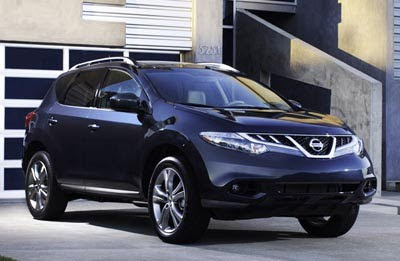
2011 Nissan Murano.
Last Updated:
Slightly simpler front end design, new colors, new SV trim.
Not much else for the new year.
The real news will be at the L.A Auto show, where we’ll finally see a soft top convertible version of the Murano.
One of the weirdest idea ever.
If they wanted a convertible, it seems that the Altima coupe would have been a much better choice…
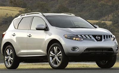
Here is this year’s model.
I still like the original 1st generation design so much more than this.
It looks sooooooo good, It takes the grounbreaking first gen and muscles it up. Very strong , athletic stance. loooove it!
@Stronzo…are you being sarcastic? If anything this car has no stance at all. This thing still is this boring/weird thing going on though the taillights at least don't look cheap anymore. The original was so much better. They lost the plot here…
I'm with you Vince, the first generation, in my opinion, was the best looking SUV ever! However, the interior was crap. This current generation interior is much better but the busy exterior styling is just ok, still better than anything from Toyota or Honda, but Mazda CX7 is probably a better looking vehicle (except for the updated sh%t eating grin).
Whenever i see the 2nd generation on the road i have to look away ! its ugly along with the cube, puke, sentra, also the boring and very very old frontier/Titan. loved the maxima till they killed it with uglyness ! just what the hell are the doing to the brand ? how do they have sales ??
Sam miller whatthehellrutalkinbout, how many names do u have? I am dead serious baby! Its a rock solid winner, no sarcasm baby!
The front end/grille remains a total mess, apparently cobbled together from various surplus parts. Nissan should do like Kia did with Peter Schreyer and hire a lead designer from Audi (or BMW or M-B). Those germans know what desigh unity means.
The first generation was a good looking vehicle.
This second generation is complete disaster. Terrible.
It's slightly better. But the front still looks like a nightmare, and the rear is probably way too conventional. Aside from the third world interior of the older Murano, I much prefer the design of the 1st gen. The convertible that I've seen in pictures… well, the whole idea for that should be scrapped. A convertible Juke would make more sense, since it's more akin to a dune buggy.
I agree that Nissan has lost their styling ability.
I remember when the first Murano came out – drop dead awesome. Then I owned one (my second Nissan) – and will never own another Murano again…Nissan mass markets POS.
Beyond that – the 2nd gen is a cobbled together mess of lines. I'd read that they've hired a new designer to fix this – and create a uniformed appearance; kinda like what Kia has/is done/doing.
Now hire someon to fix the engine, tranny and every part north of those parts – and fix the dealers – who insist on giving your wallet a biopsy every time you visit.
Ohh for God's sake be quiet, the car looks good, this guy doesn't like anything unless it's a Ford, Buick or Hyundai
Less toothy grille, but still ugly. This is the right wheel size for it. I do not like CVTs. May be after i drive one…:)
"Ohh for God's sake be quiet, the car looks good, this guy doesn't like anything unless it's a Ford, Buick or Hyundai"
You need to get your eyes checked. This is a tragic design. And the sales numbers that have flopped since the first generation Murano prove it.
Very few can actually claim their sales have not dropped in the last two years, so your are not saying much.
Those tail lights….Holy Lexus Batman!!!
Very few can actually claim their sales have not dropped in the last two years, so your are not saying much.
Jeep Wrangler sales went UP (16%)the same quarter that GMC dropped 40% AND Toyota (trucks) dropped 60%
(2009)
And 2010 looks to be an even better year yet at Jeep!
"Jeep. The One and Only"
Whats the Jeep got to do with this post?